Troubleshooting
Use design to reduce errors, and when they do happen, show users you are there for them
Principles at a glance
-
01
Design to prevent manual entry errors
↓
-
02
When mistakes do happen, be supportive
↓
Principles in action
Design to prevent manual entry errors
Principle 01
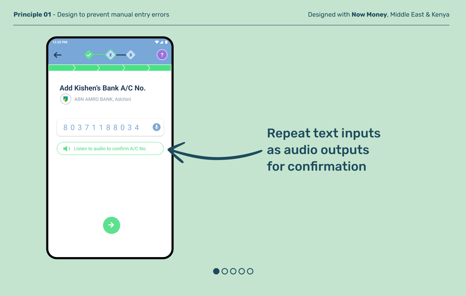
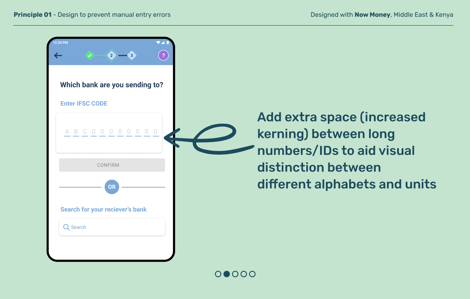
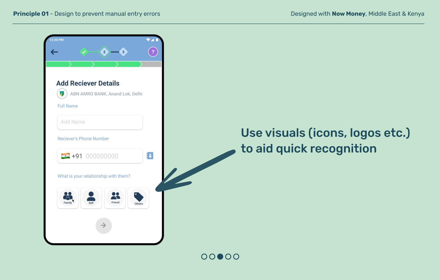
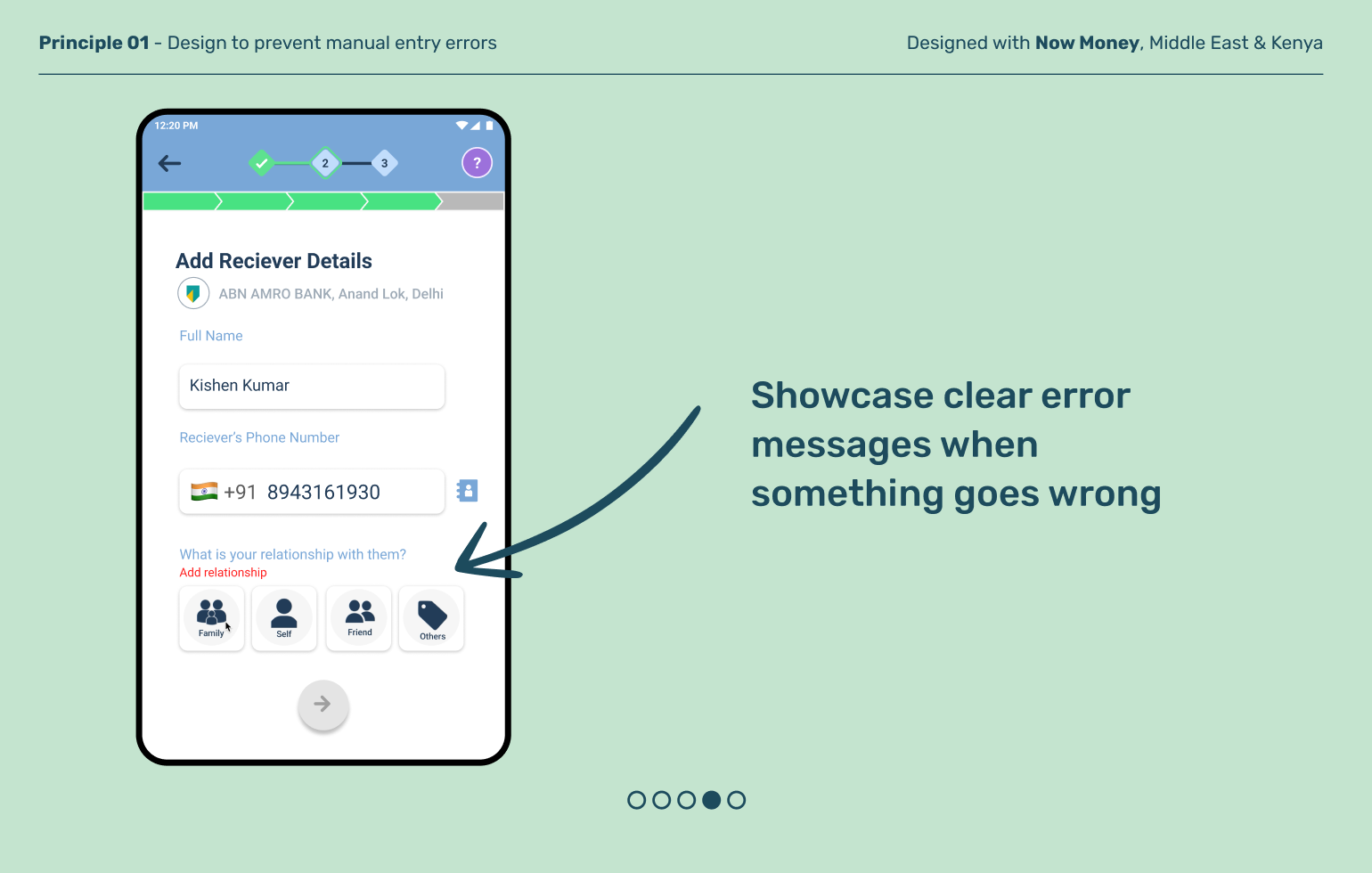
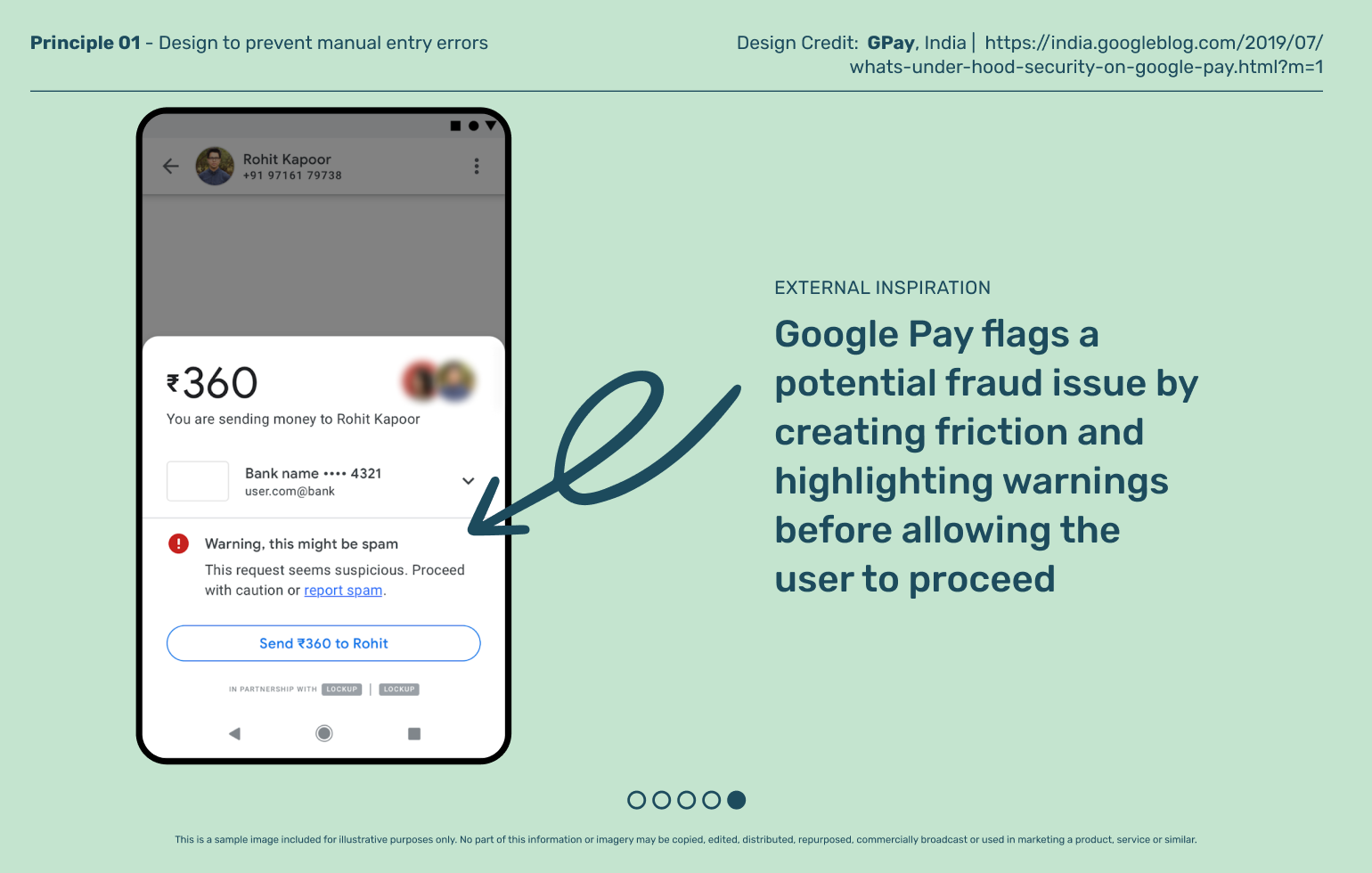
Sometimes, manual entries are unavoidable. Mistaking entry field labels, mistyping numbers and alphabets, and clicking too quickly and more are common errors that can lead users to lose trust, or worse, lose money. Good design makes it harder for these mistakes to happen, and flags them off when they do.
Principle 02
When mistakes do happen, be supportive
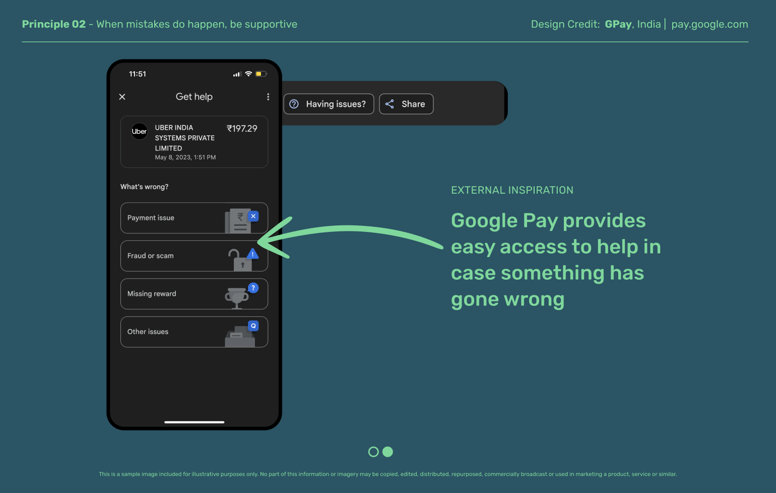
Technical and human glitches can happen. To the extent possible, automate resolution—especially for any money that has been debited from a user’s account but not sent successfully. Provide always-on help on completion screens for the rest.
Explore other moments in Digital Payments & Remittances


