Making A Transaction
Help users overcome the fear of making a mistake and strengthen mental models of digital payments
Principles at a glance
-
01
Nudge what’s next with a zero-balance wallet
↓
-
02
Signpost what is ahead so users can look before they leap
↓
-
03
Autofill where you can
↓
-
04
Acknowledge and celebrate payment success
↓
Principles in action
Nudge what’s next with a zero-balance wallet
Principle 01
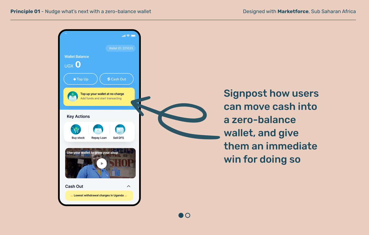
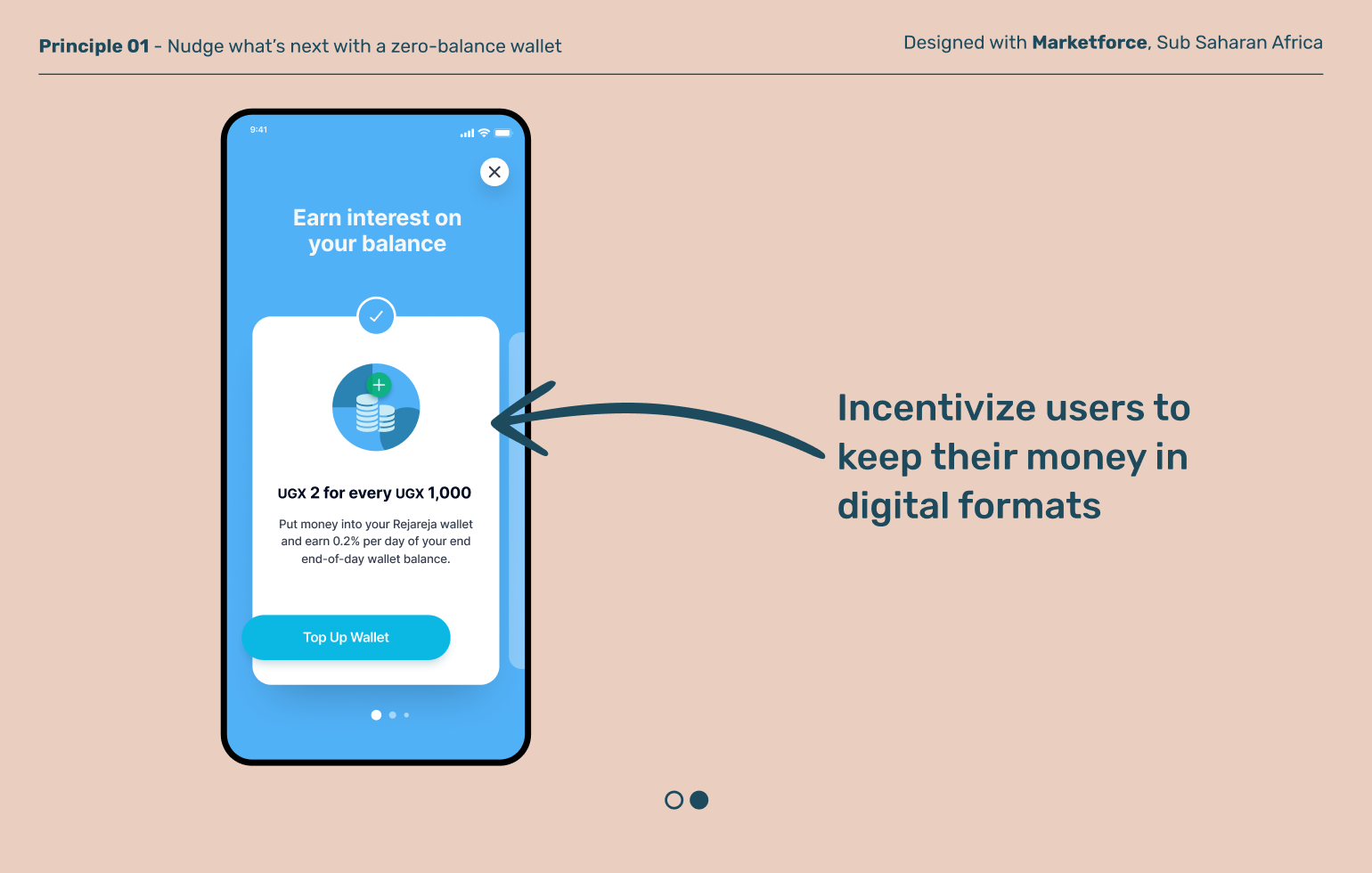
Wallet homepages are often designed to highlight the current balance, but this is sub-optimal for new users who haven’t yet loaded money. Think carefully about your design for the zero balance wallet, rather than defaulting to the generic home screen.
Principle 02
Signpost what is ahead so users can look before they leap
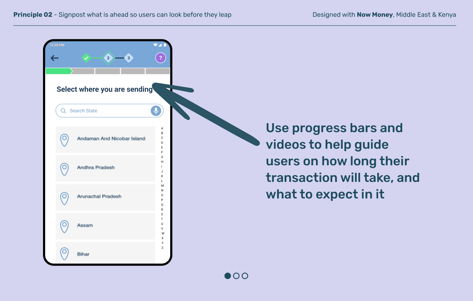
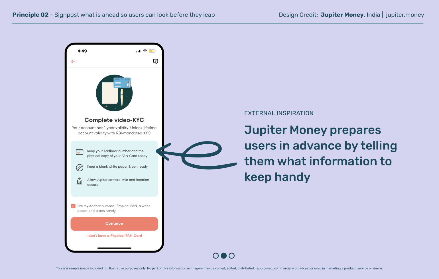
Last mile users can feel anxious when they’re making their first digital transactions. What if they make a mistake and lose their money? Help users feel more confident by explaining what is ahead, what information they need to keep handy, and enabling them to review before they commit.
Principle 03
Autofill where you can
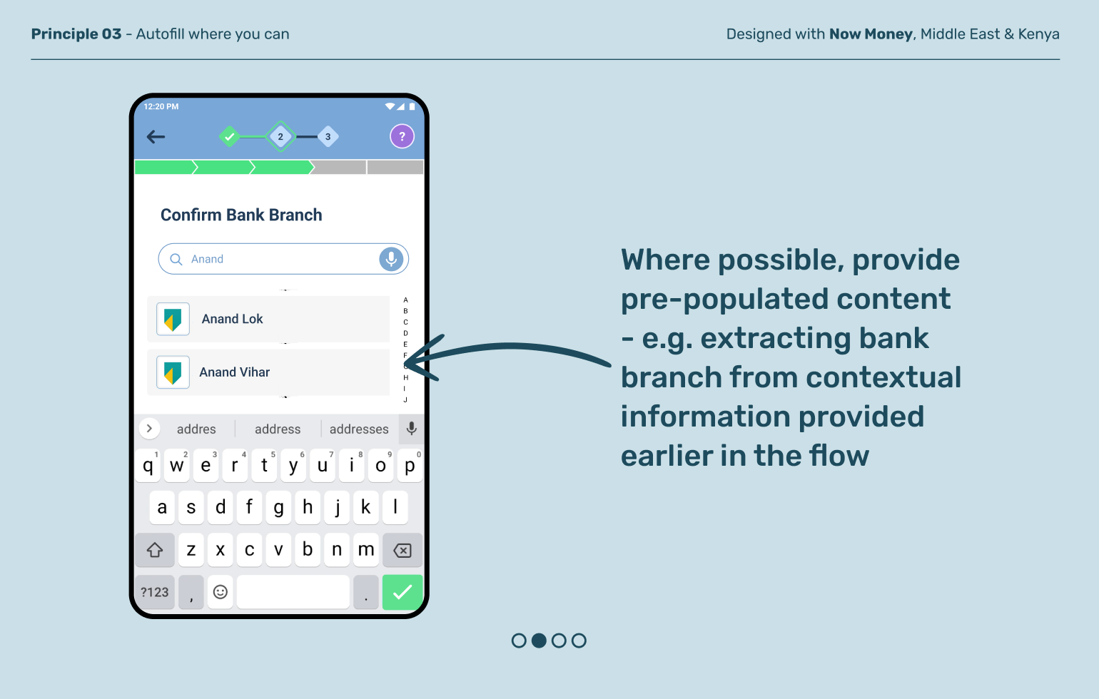
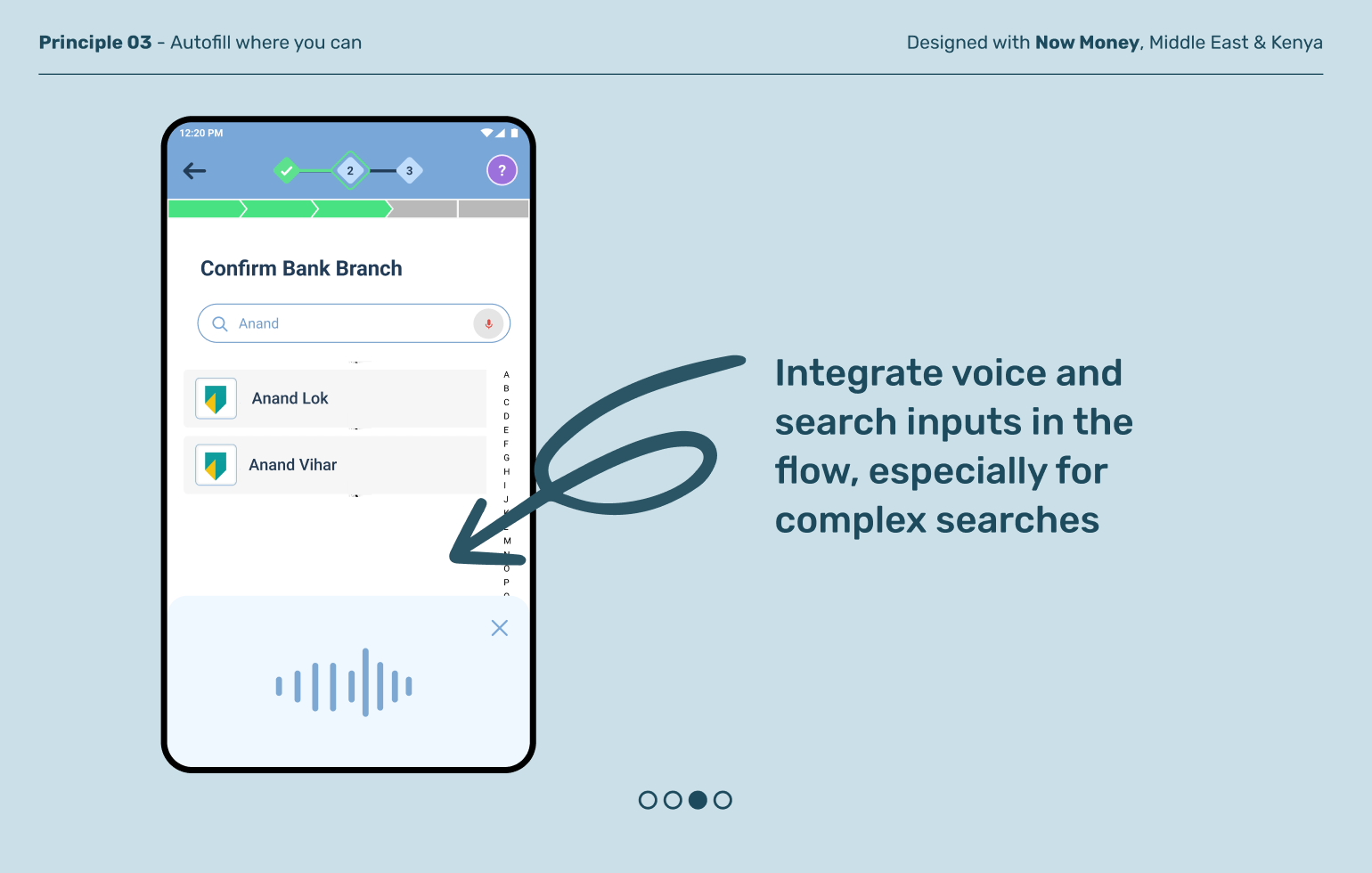
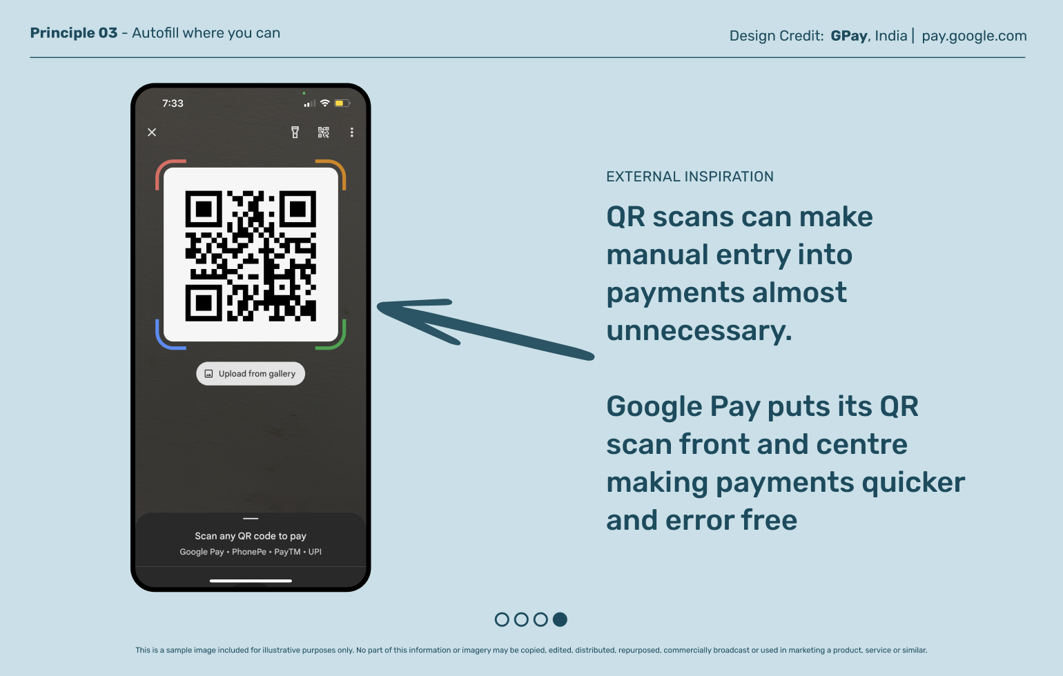
Manual entries are not only time consuming and frustrating, they are often a significant source of errors in digital payments. Use phone cameras to scan receipts or QR codes, or parse audio entries to reduce manual errors.
Principle 04
Acknowledge and celebrate success
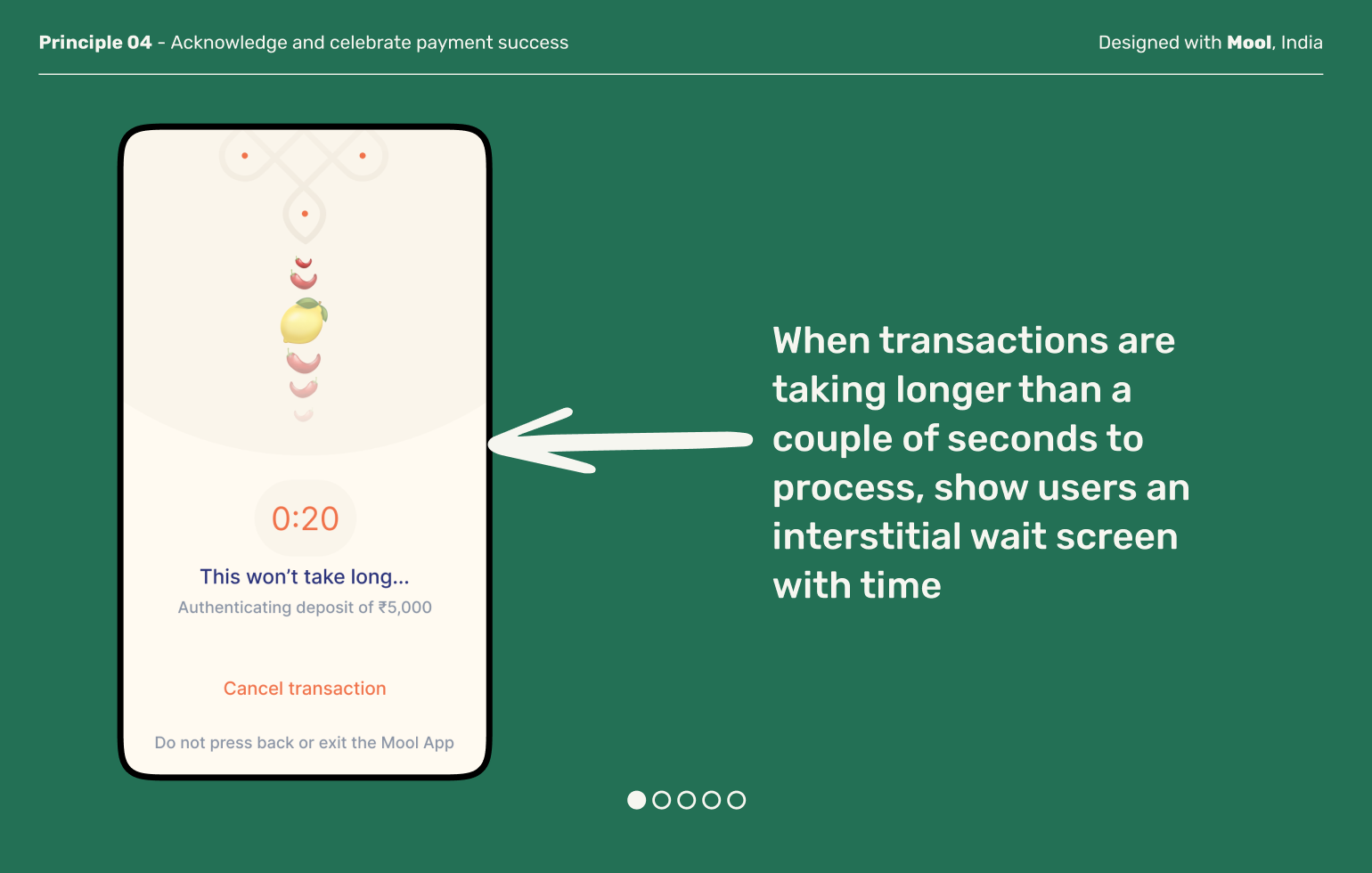
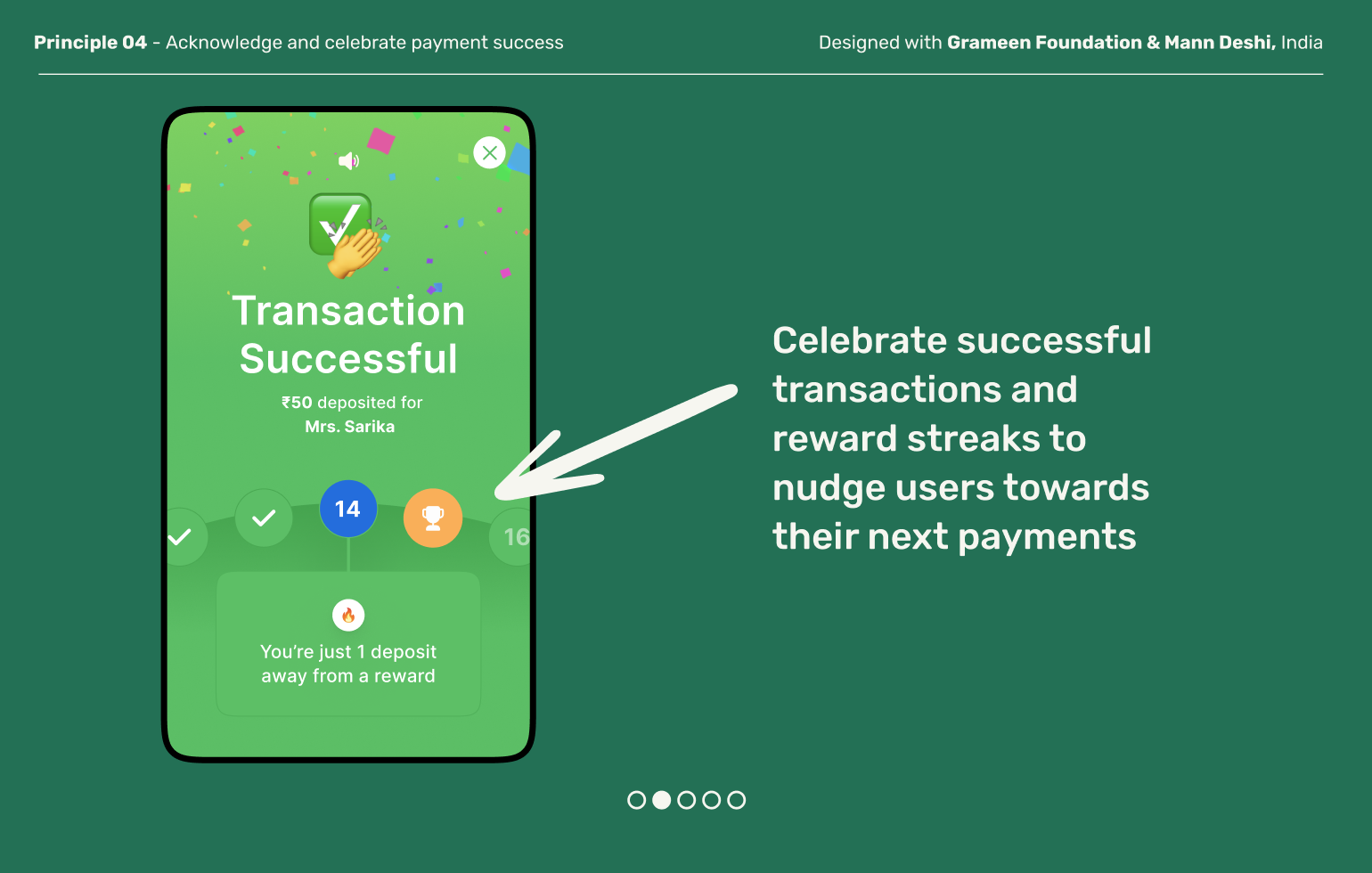
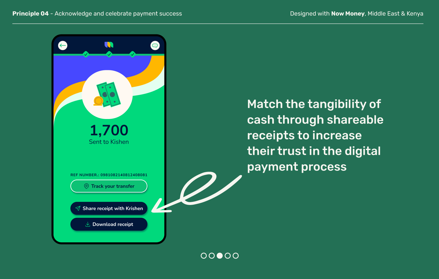
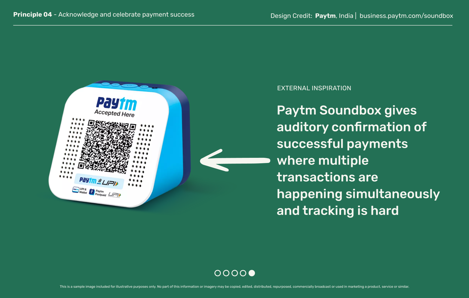
When cash exchanges hands, there is a tangibility to that makes completion of the transaction obvious. Help users feel a similar sense of completion when they transact digitally through success screens and audio inputs
Explore other moments in Digital Payments & Remittances


