Launch Screens
Land the first impression and set the tone for the rest of their experience
Principles at a glance
-
01
Build a connection and highlight your value prop
↓
-
02
Showcase financial value in simple, everyday terms
↓
-
03
Emphasize trustworthiness as they get started
↓
-
04
Choose bandwidth over interactivity
↓
Principles in action
Build a connection and highlight your value prop
Principle 01
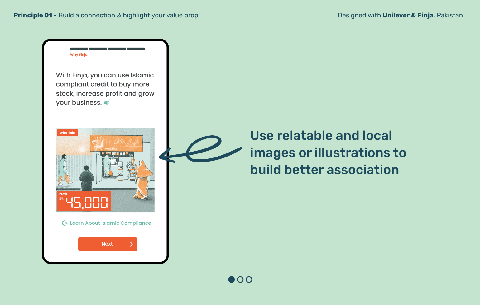
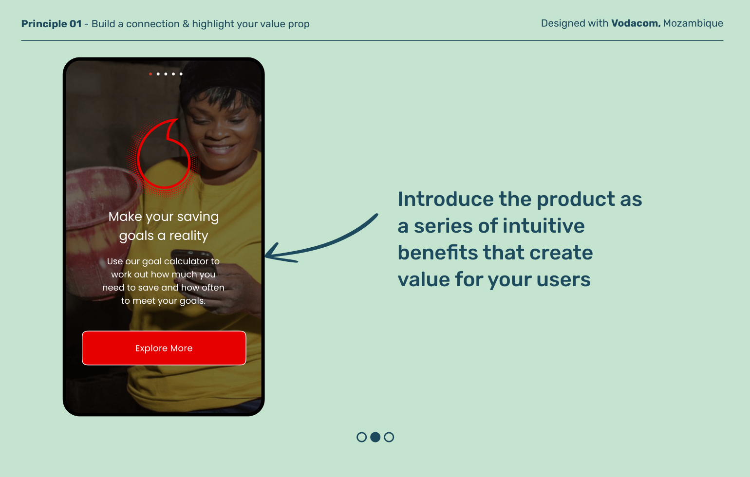
Formal finance is uncharted territory for last mile users. Localize visual design and continually clarify the key benefits of the product to help users feel like they’re in the right place.
Principle 02
Showcase financial value in simple, everyday terms
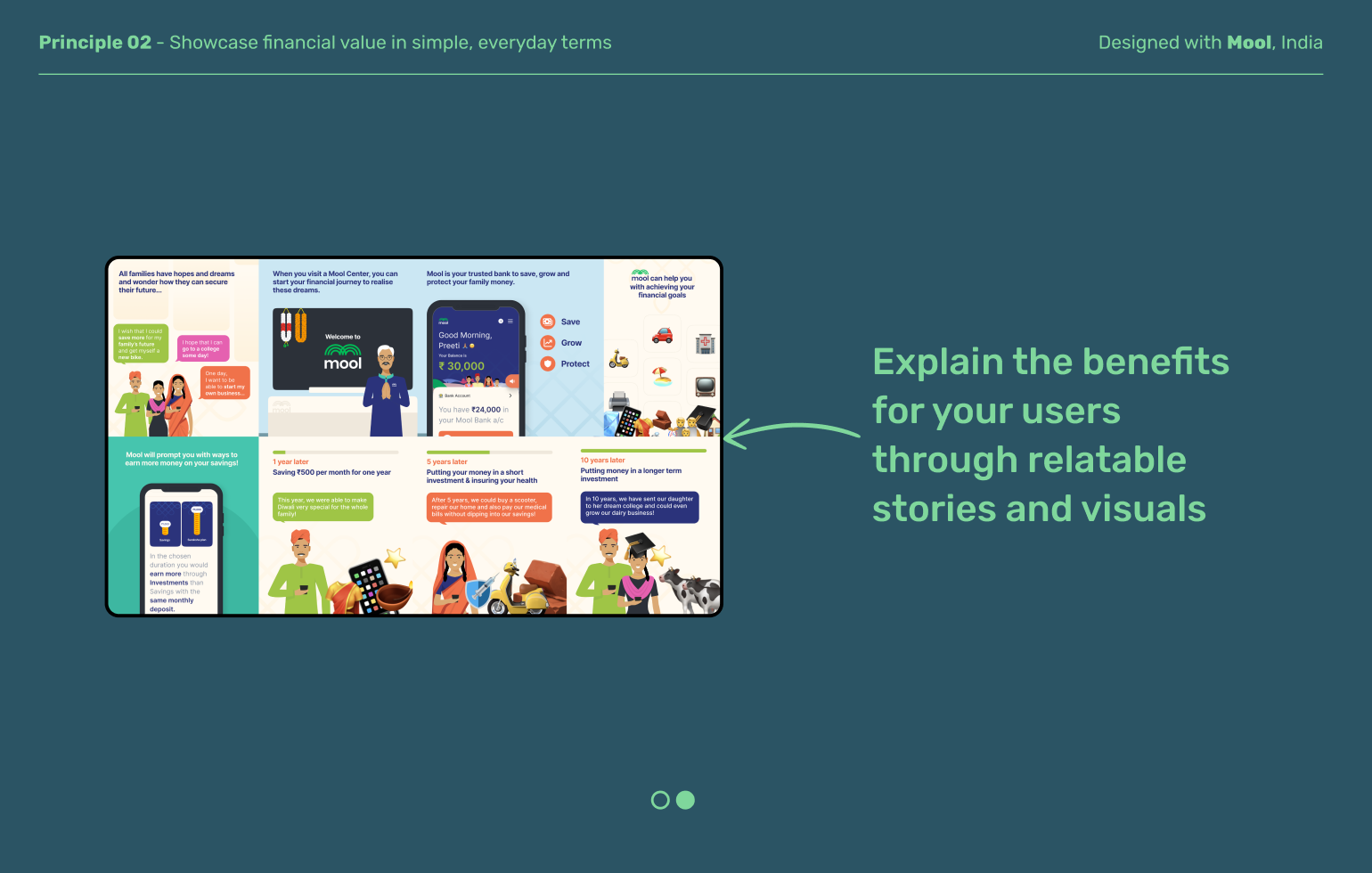
New internet users may not be familiar with formal banking terms or jargon. Use language that builds on existing mental models and emphasizes how formal finance can integrate with and offer benefits in everyday lives.
Principle 03
Emphasize trustworthiness as they get started
Outside of core social or family groups, many users operate in low trust environments where the fear of being scammed is real and formal institutions are important credibility signals. Showing visual proof that trusted organizations and people endorse this product can go a long way to building a user’s willingness to try.
Principle 04
When it comes to interactions, choose bandwidth over interactivity
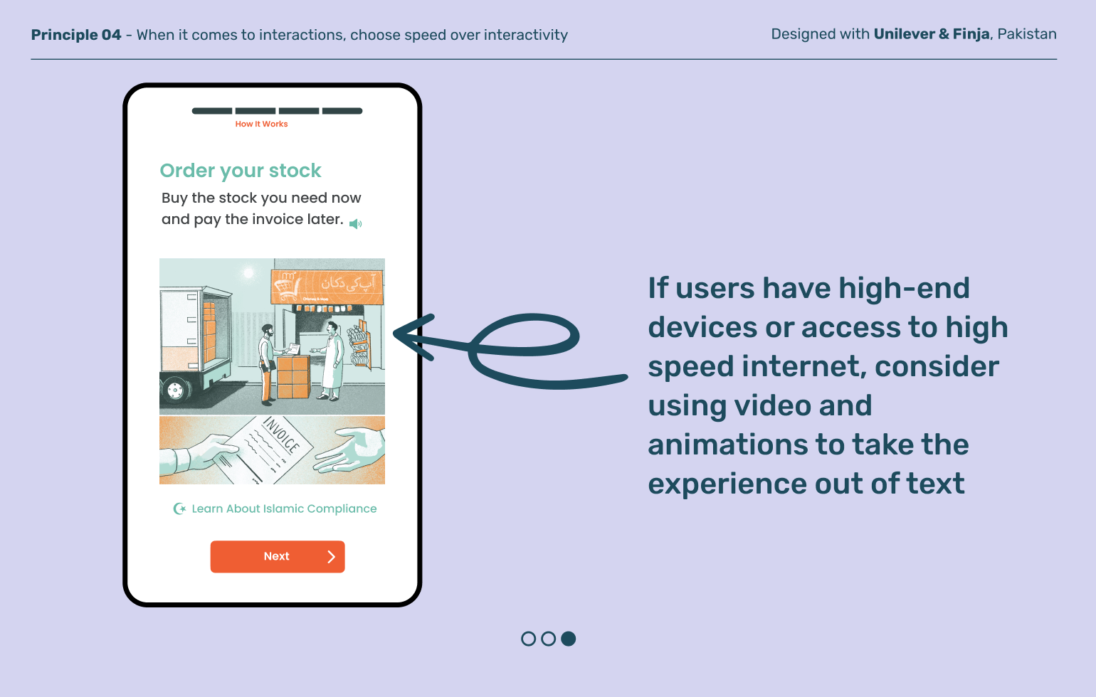
While rich media and interactive onboarding experiences can deliver delight, real-world conditions like older, low-cost devices and slow data speeds mean these rich experiences never reach last-mile users. Embrace these technical constraints and design your product to rise to the challenge to benefit many more users.
Explore other moments
in Discovery And Onboarding


