Principles at a glance
-
01
Derive a visual language from local aesthetics
↓
-
02
Humanize the experience
↓
-
03
Aim for “friendly professional”
↓
Principles in action
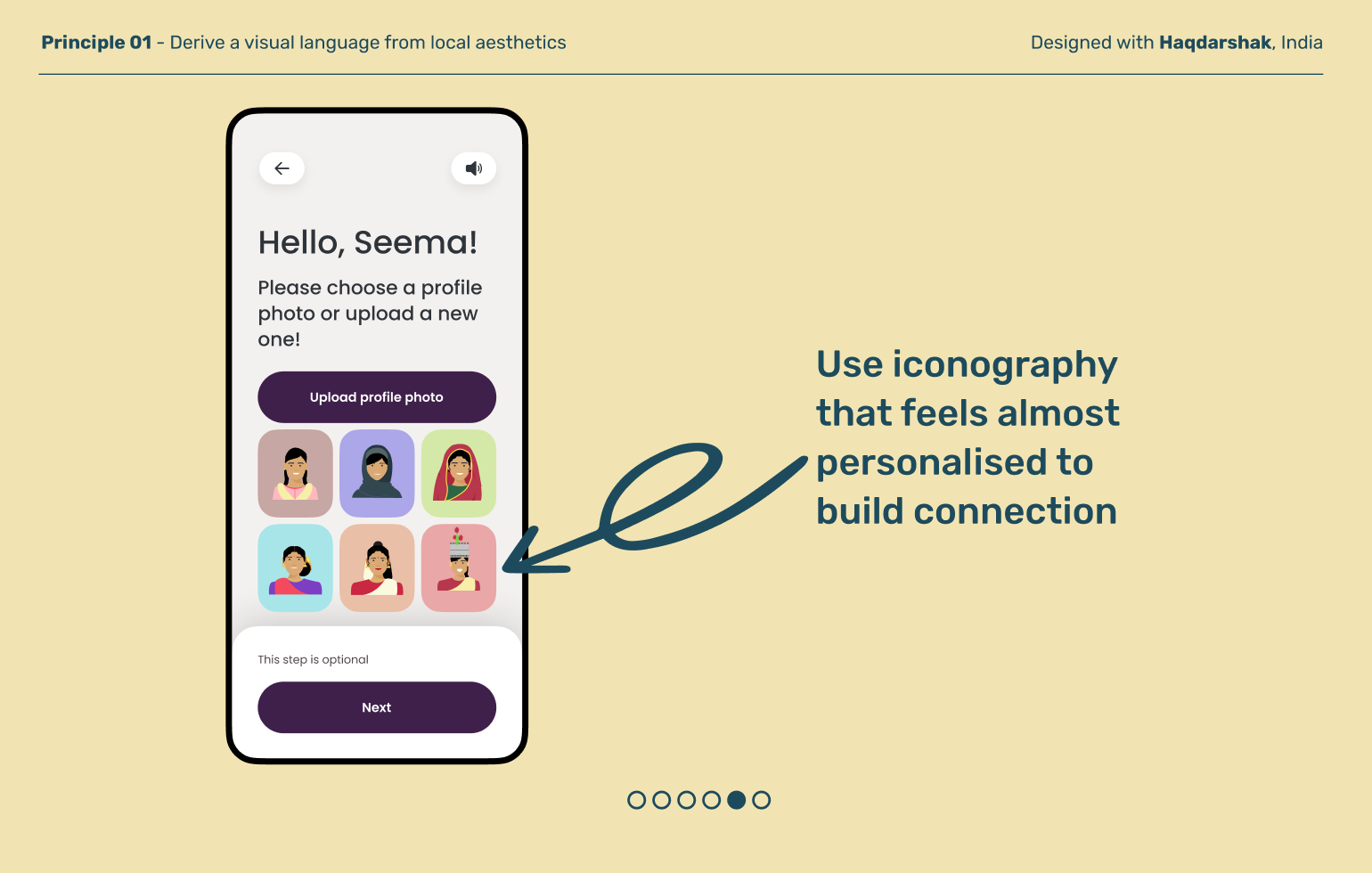
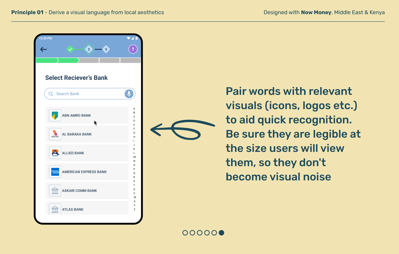
Derive a visual language from local aesthetics
Principle 01
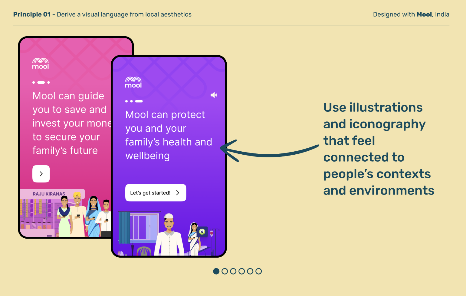
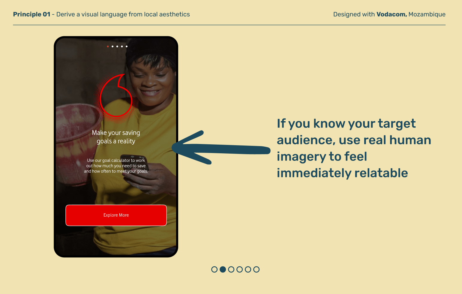
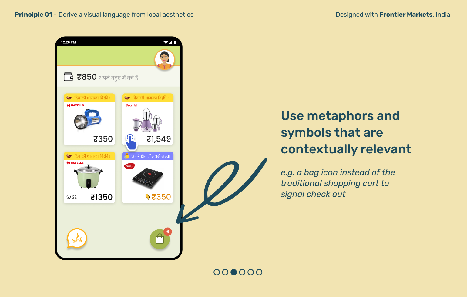
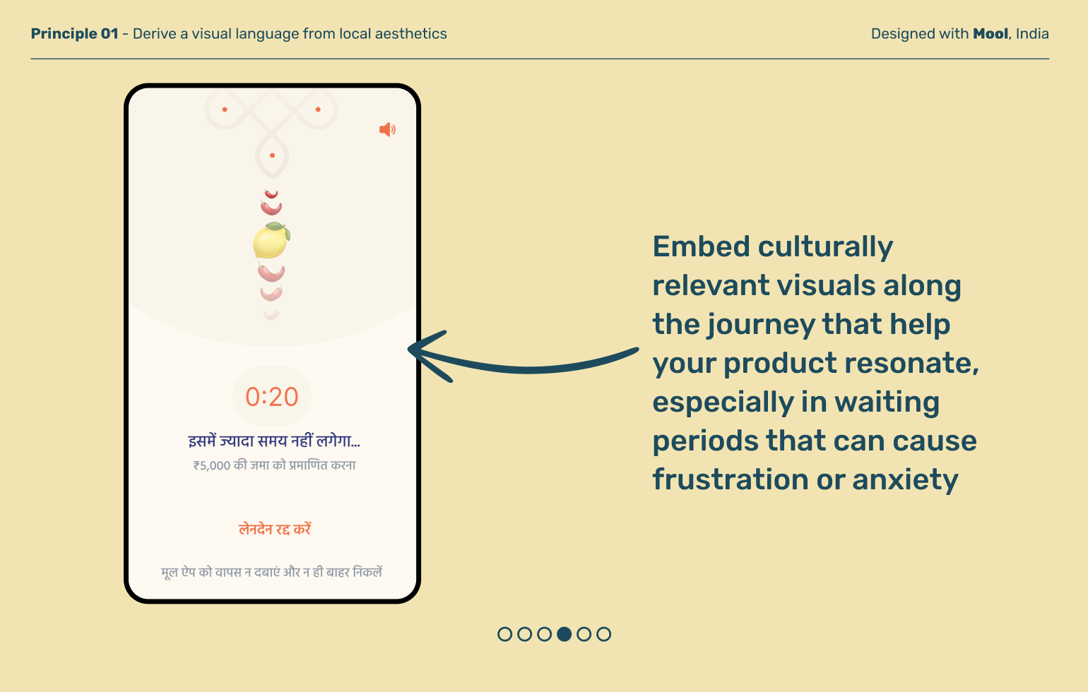
The model of minimalist UI doesn’t always resonate. In many parts of the world, people’s physical lives have vibrant colors, patterns, and designs. Adopt local visual cues and interaction patterns in order to demonstrate your product’s relevance and promote adoption.
Principle 02
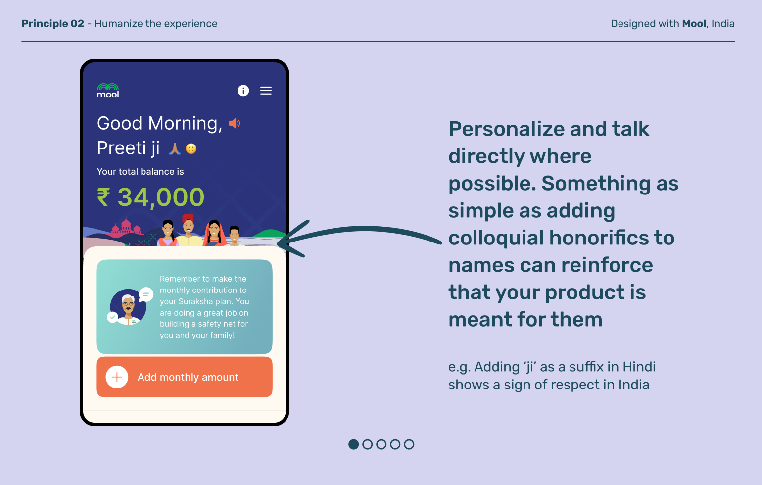
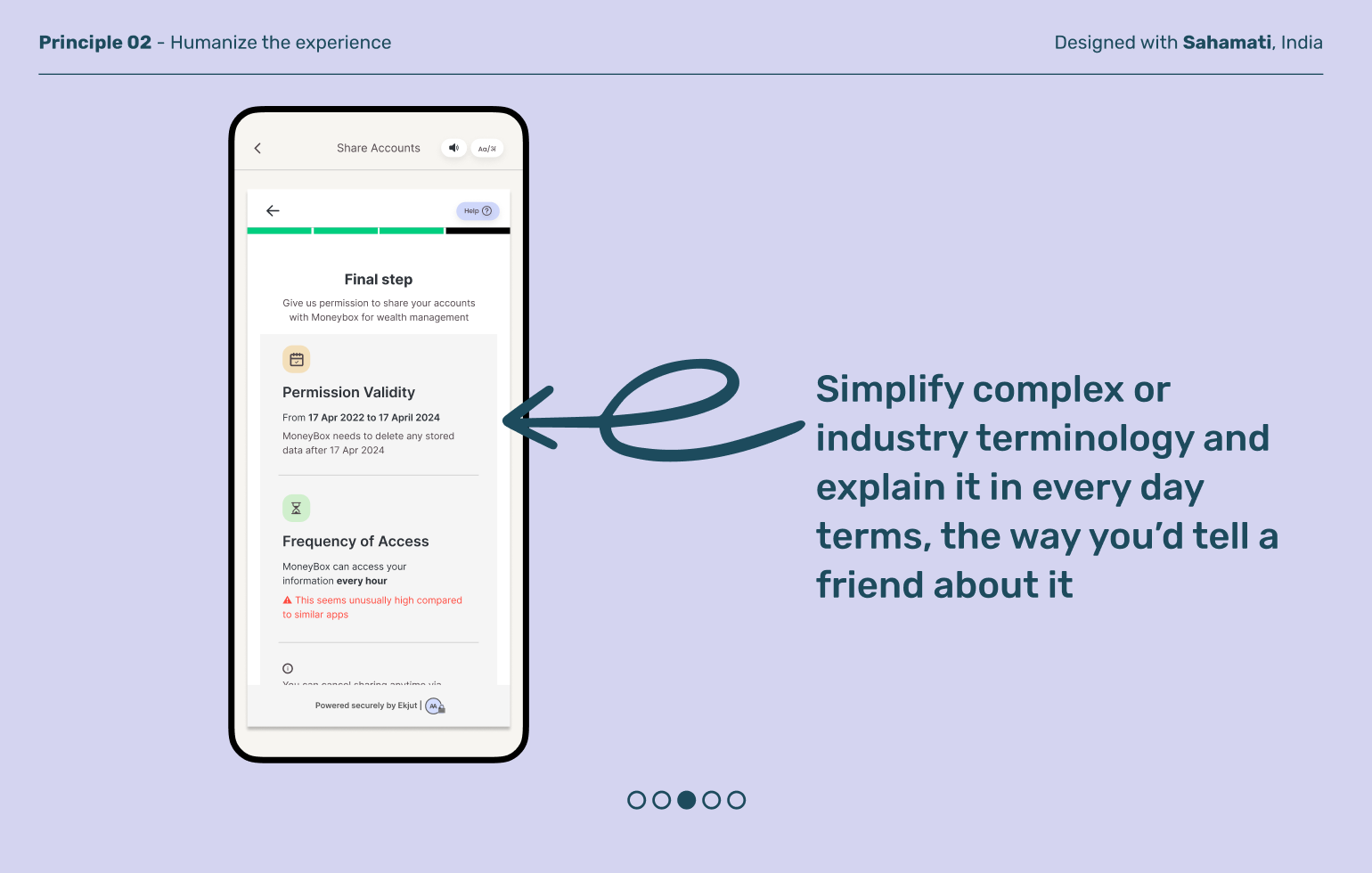
Humanize the experience
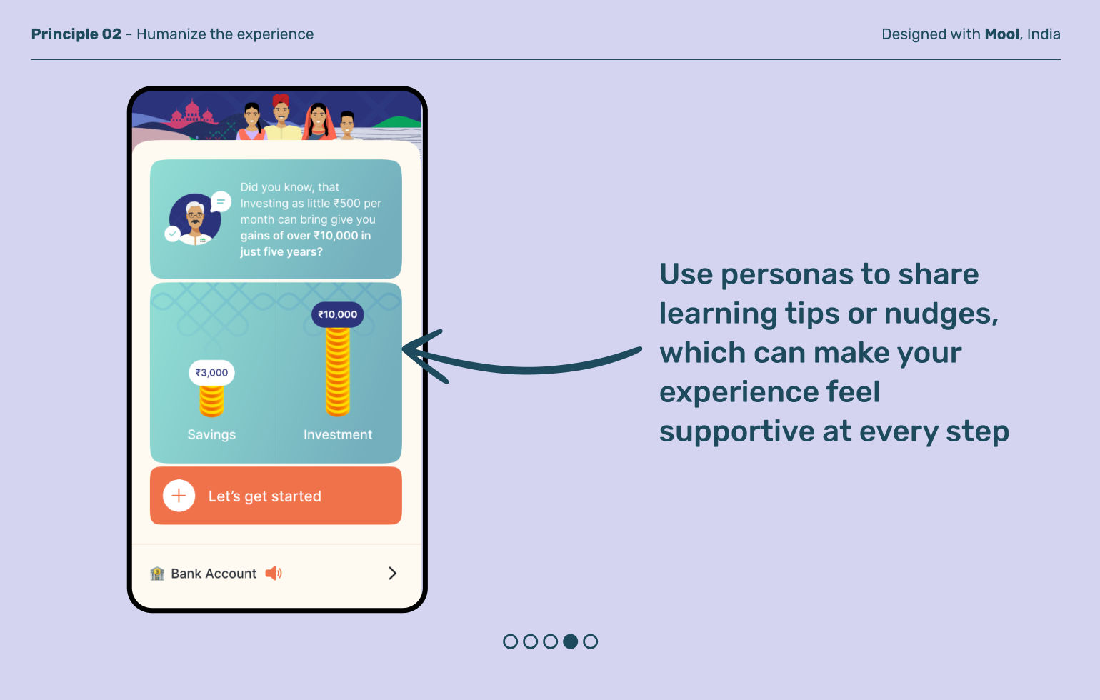
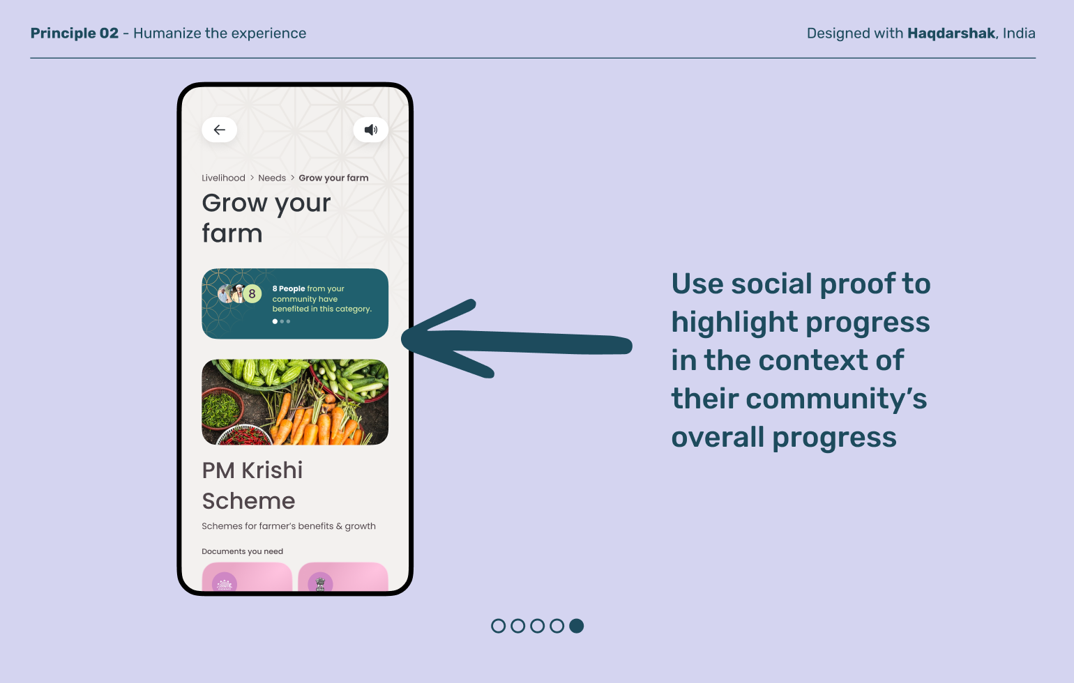
Last-mile users benefit from products designed to be relatable, personal, and friendly. Choose language –written and visual – that’s short, simple, and captures the way people talk in their real-world lives.
Principle 03
Aim for “friendly professional”
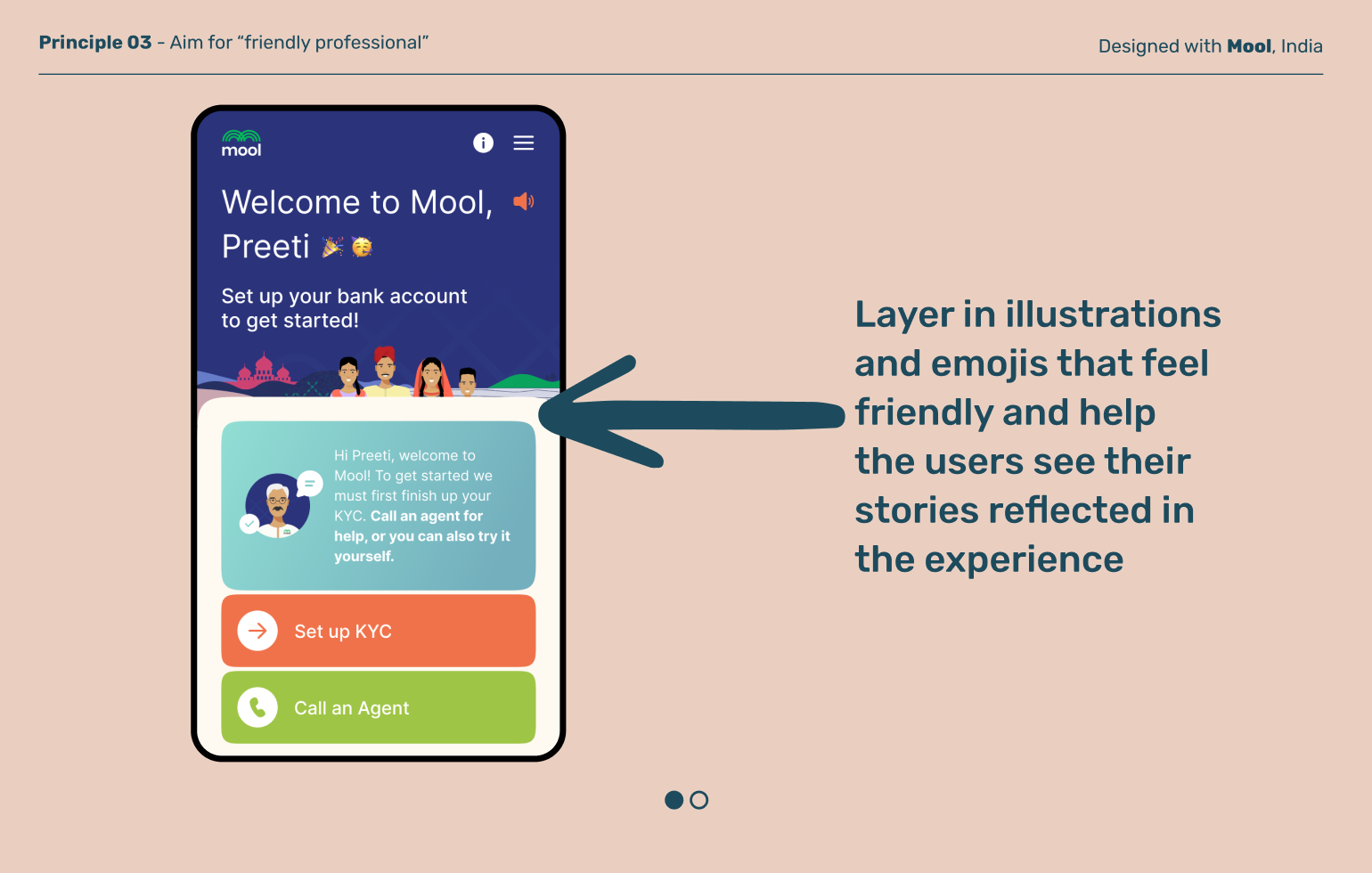
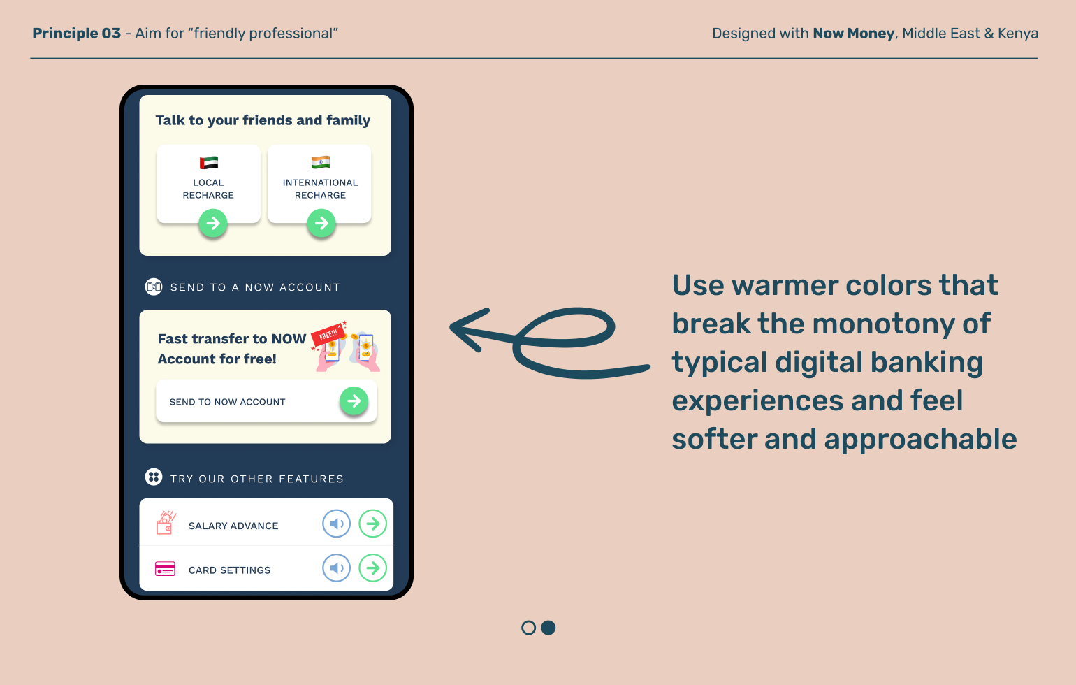
Traditional financial apps default to a serious, authoritative brand and tone of voice, which can leave last-mile users feeling unwelcome and intimidated. Find the right balance between 'professional' and 'friendly' through the use of warm colors, imagery, and language that helps last-mile users feel like the product is for them.
Explore other moments
in Product Architecture


