Principles at a glance
-
01
Provide relevant guidance at the landing moment
↓
-
02
Deeply personalize to your user’s journey
↓
-
03
Surface critical information right up top
↓
Principles in action
Provide relevant guidance at the landing moment
Principle 01
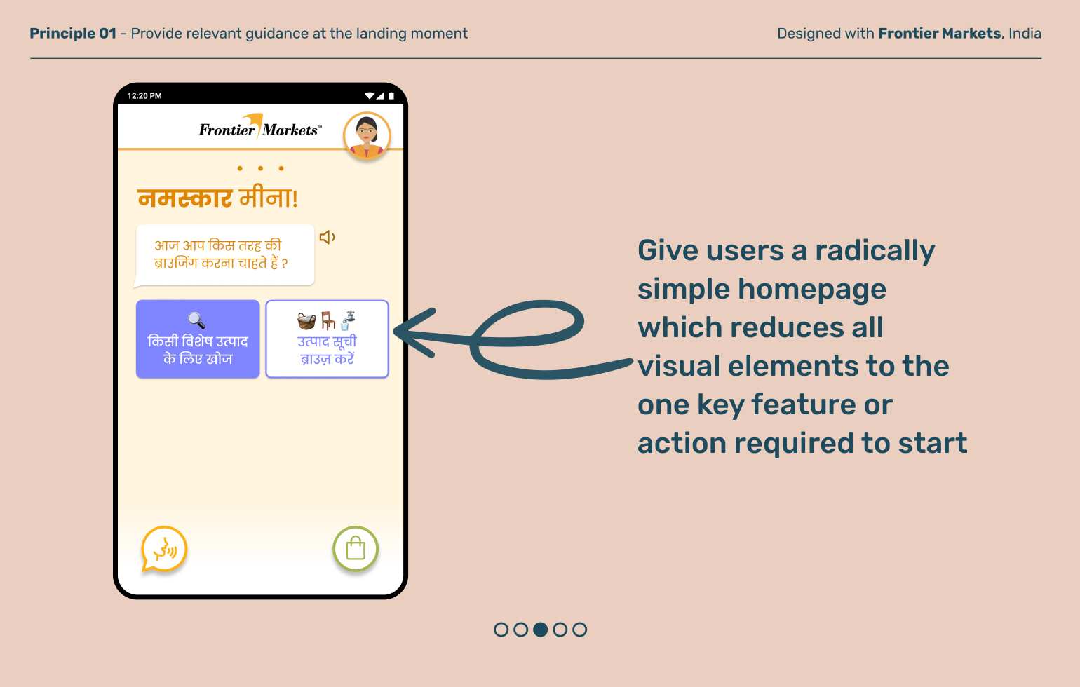
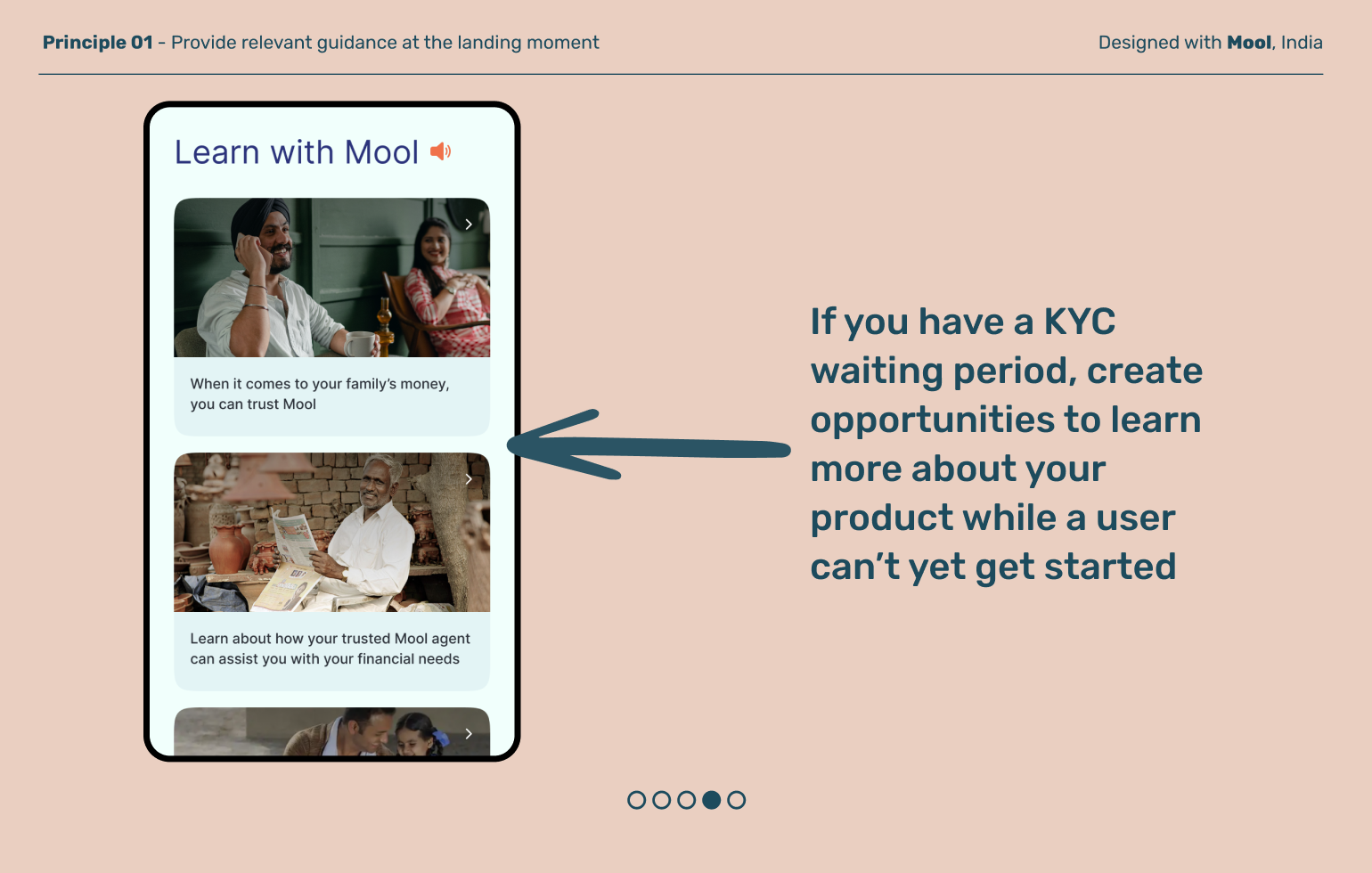
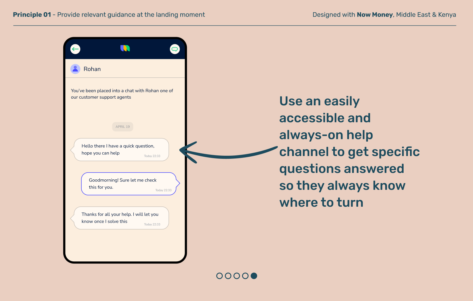
Many financial products give users access to a range of services, but that can be overwhelming, especially if it’s their first time interacting with digital banking. Initial home pages should be organized by only necessary information, along with guidance to get started, to encourage users to explore without the fear of failure.
Deeply personalize to a user’s journey
Principle 02
The homepage is a crucial part of a digital product architecture. It’s a launchpad for discovery and a place to promote user engagement. A crowded homepage can easily start to feel overwhelming and result in a poor first impression. Evolve your homepage as your users’ journeys progress, growing and populating with relevant information based on what they need and how confident they are.
Principle 03
Surface critical information right up top
The top half of the home screen is critical real estate that grabs a user’s attention every time they login. Use this space to highlight important actions, relevant insights, and content that people seek in order to build transparency and trust in your product.
Explore other moments
in Product Architecture


