Principles at a glance
-
01
Minimize hierarchy
↓
-
02
Offer alternate interactions
↓
Principles in action
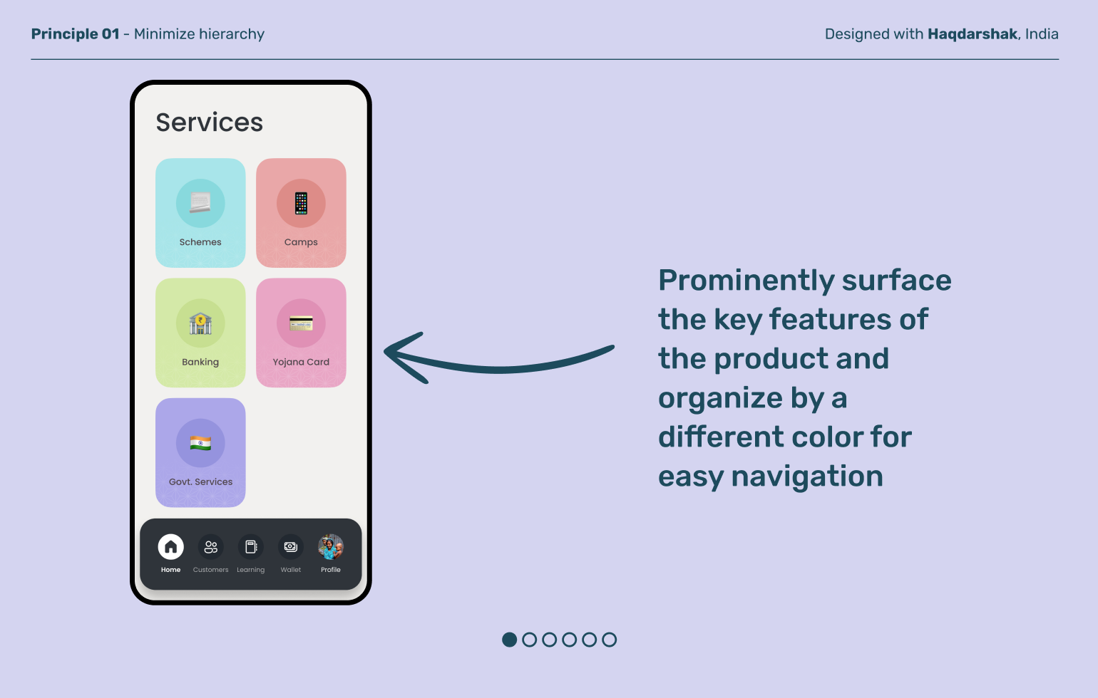
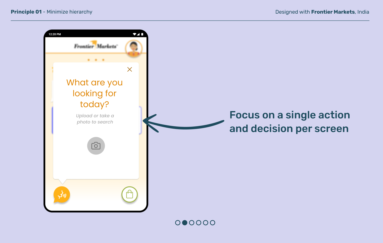
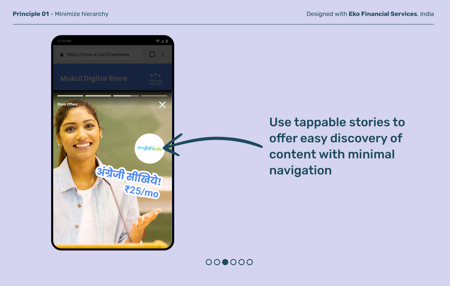
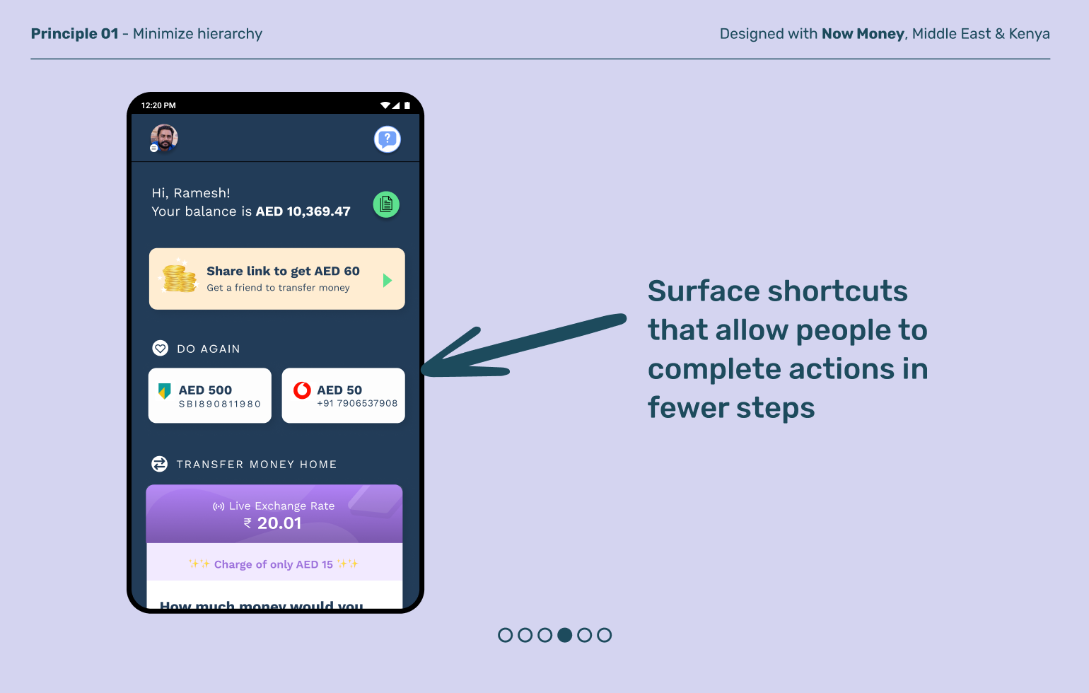
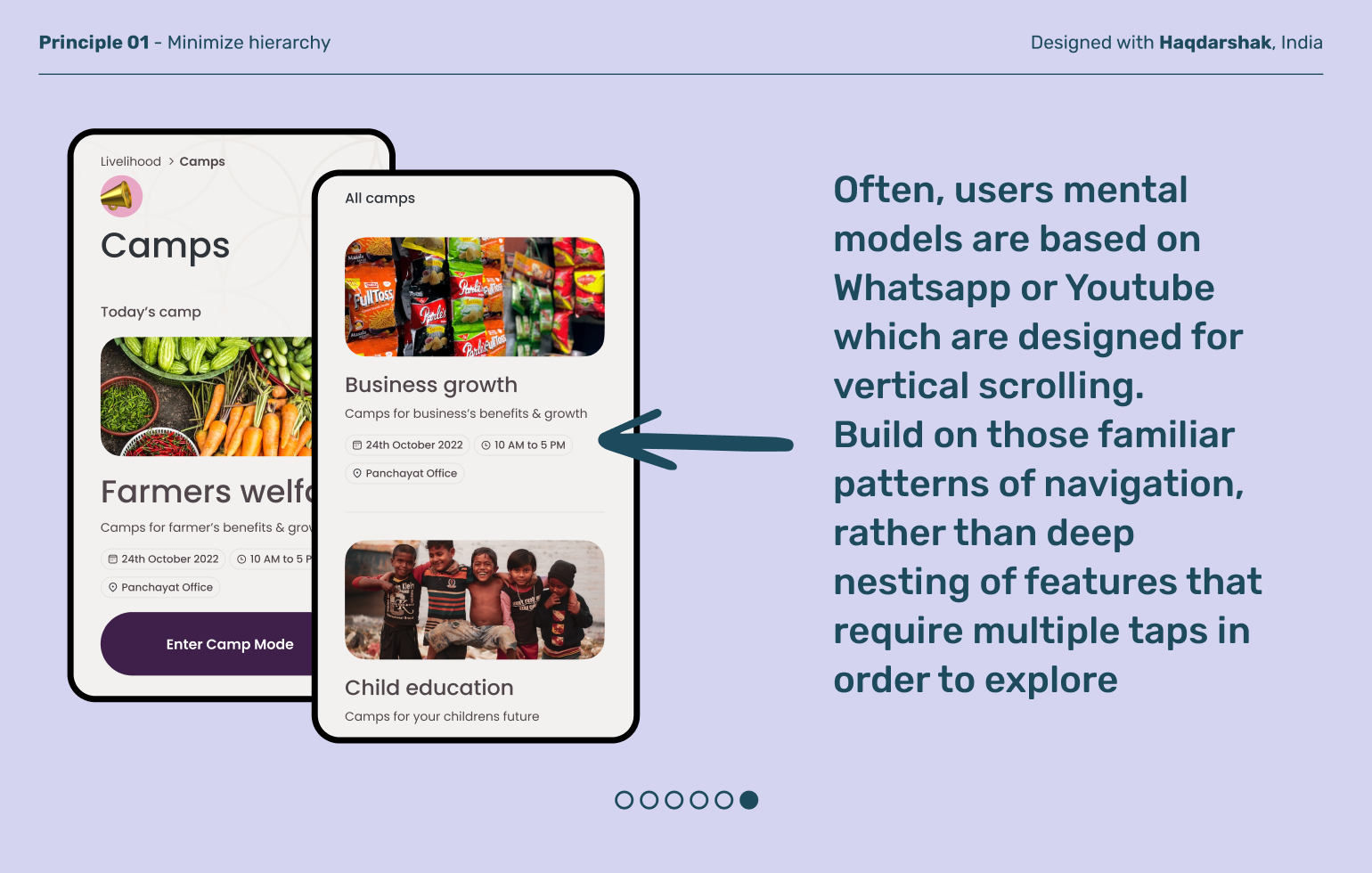
New to apps and smartphones, a last-mile user can quickly feel lost and not know where they are in a product. Sometimes apps have complex hierarchies because of operational needs or technical constraints, but this shouldn't determine a user's experience of your product. Create straightforward flows that help people get to what they need quickly and easily.
Minimize hierarchy
Principle 01
Principle 02
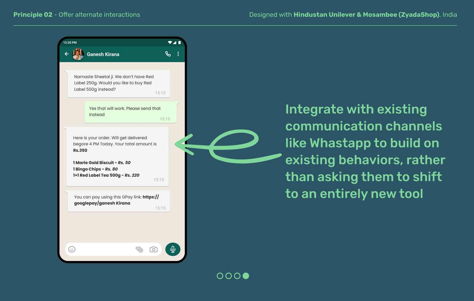
Offer alternate interactions
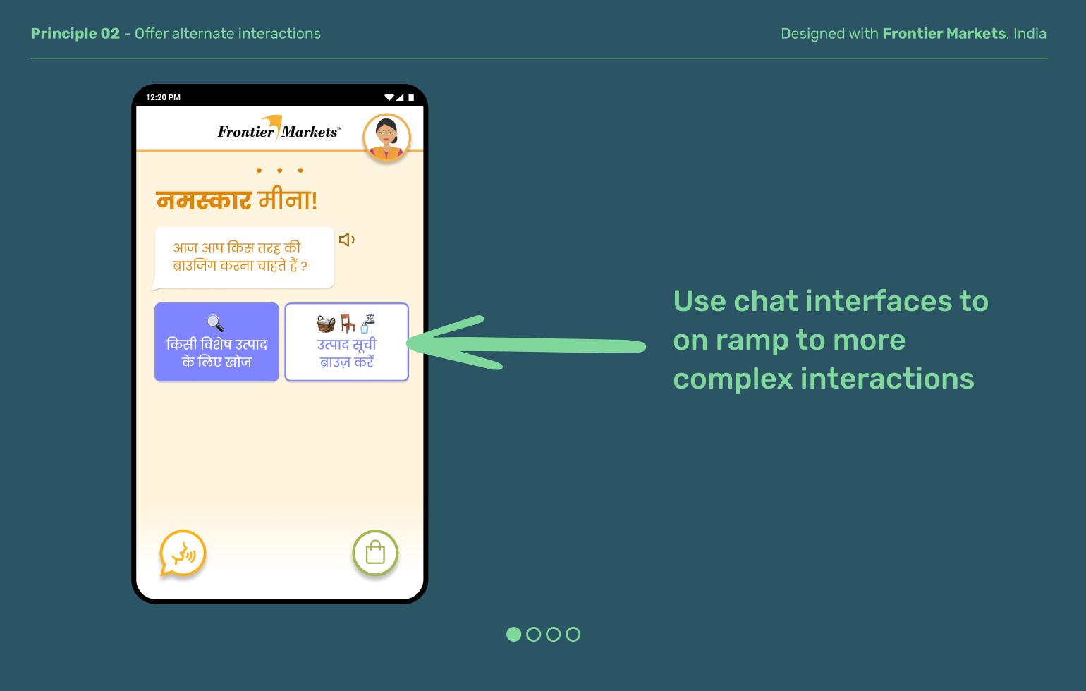
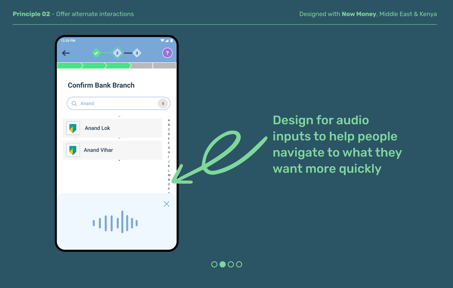
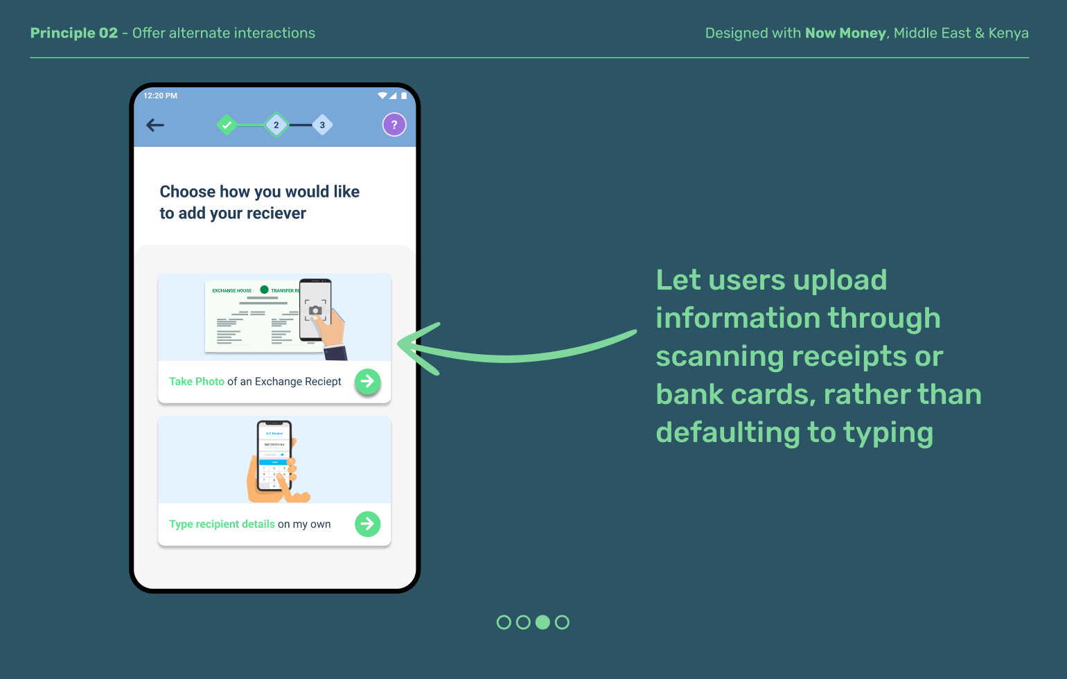
Last-mile users have a range of textual and digital literacy levels. Give them choices for how to take in content and interact with your product. Offer multiple formats, e.g., text and image, audio and text, or conversational interfaces. This will build users' confidence in using your product, and help them feel it’s designed for them.
Explore other moments
in Product Architecture


