Principles at a glance
-
01
Put savings in context of their financial lives
↓
-
02
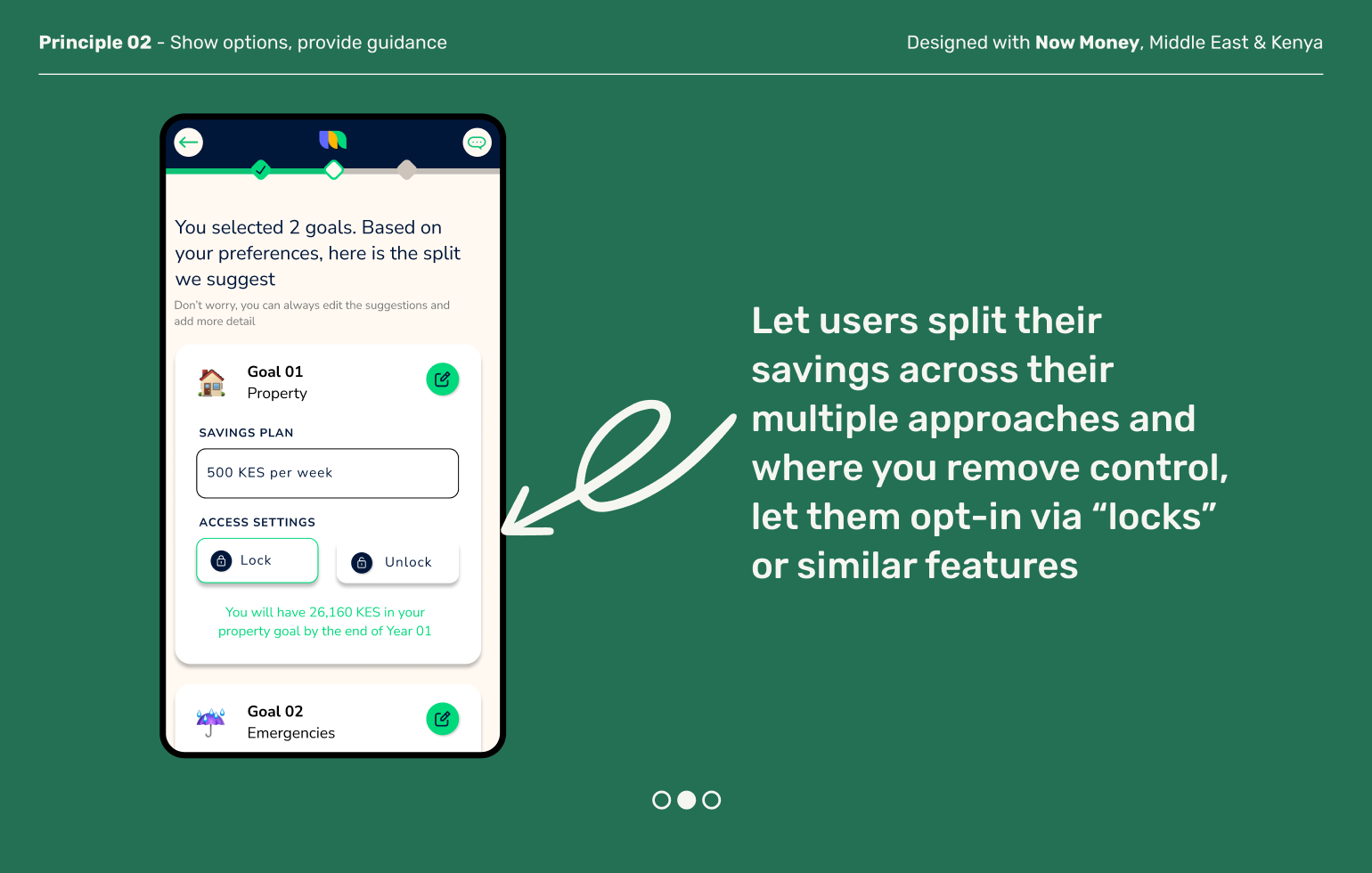
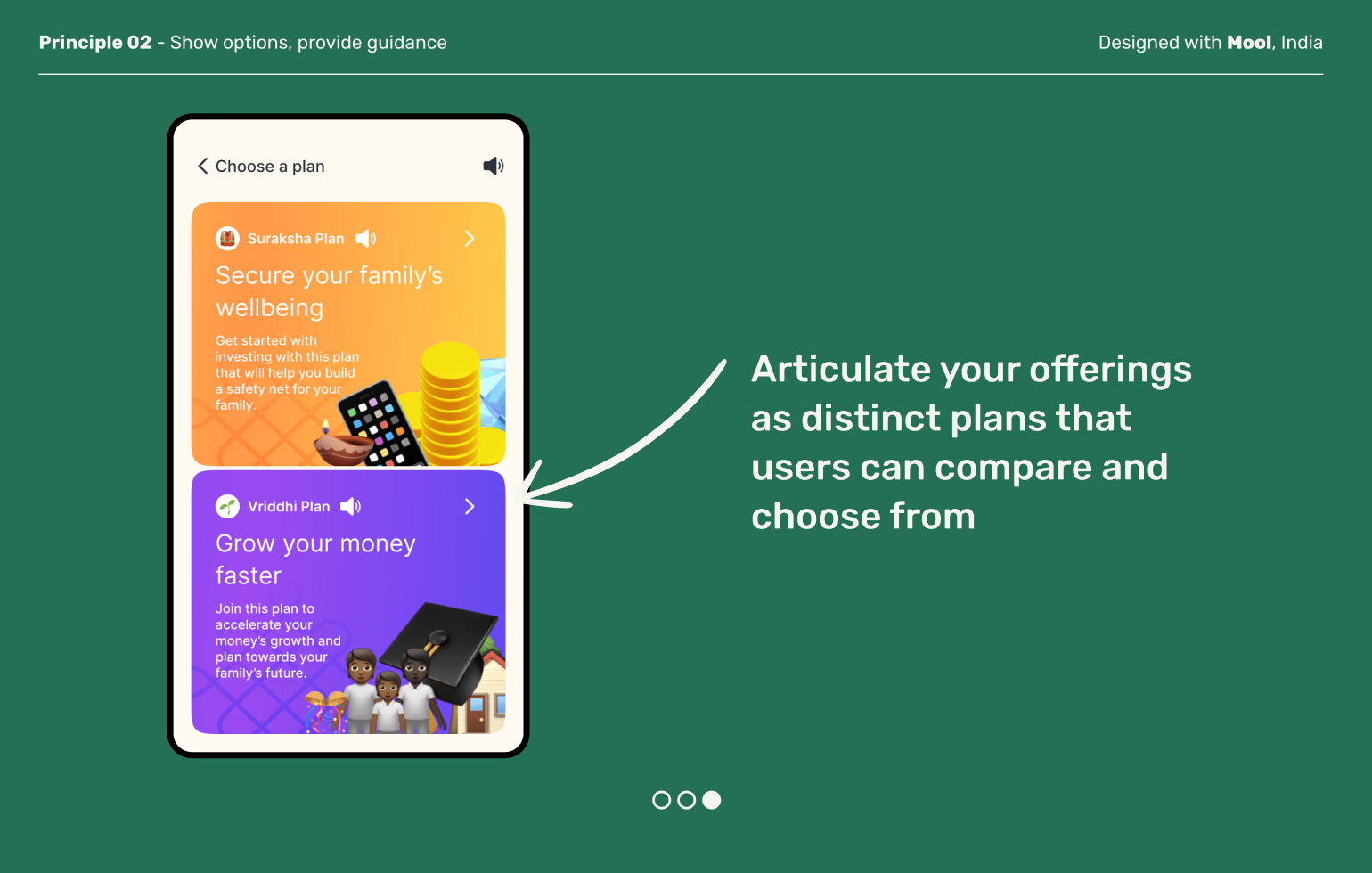
Show options, provide guidance
↓
-
03
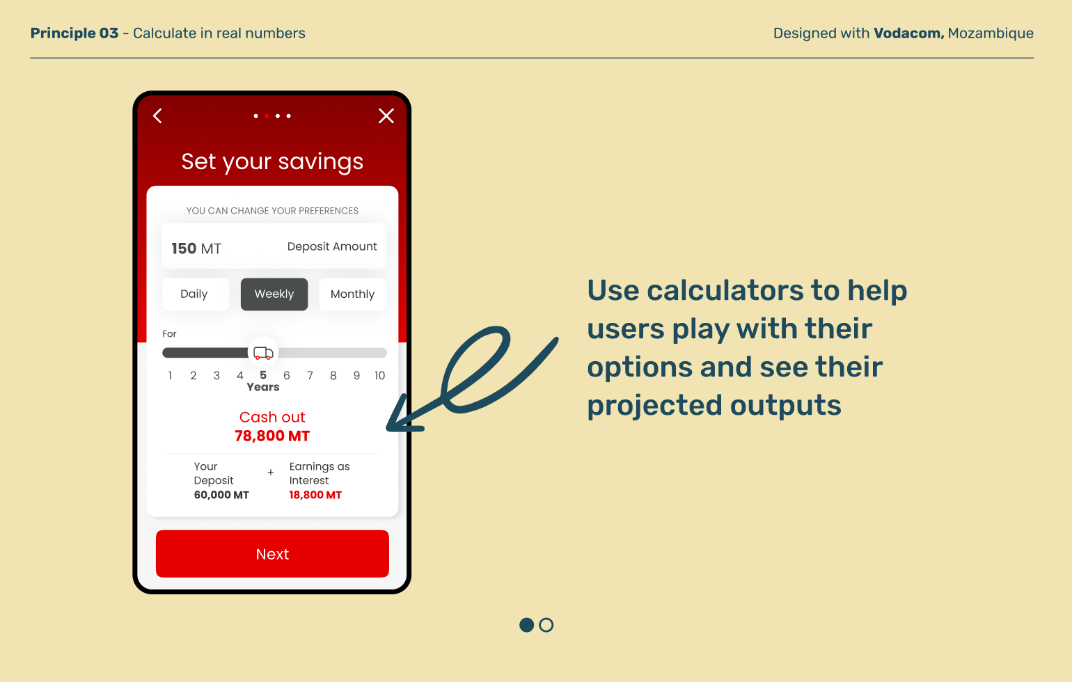
Calculate in real numbers
↓
-
04
Ask “are you sure?”
↓
Principles in action
Put savings in the context of their financial lives
Principle 01
Most people don’t save for the sake of savings—they save to live the life they want. That might mean saving for an item for the house, a future expense for their family, or a dream they are working towards. Helping users articulate and work back from their goals can help them feel more in control and motivated to reach their targets.
Show options, provide guidance
Principle 02
When users set up a mechanism to automate their savings, they often need to make many decisions—schedules, deposit amounts, risk appetite and more. Good design balances the flexibility and agency of seeing choices within contextual guidance and changeable defaults that help the user get started without getting overhwelmed.
Principle 03
Calculate in real numbers
Saving plans can feel like a lot of mental math. Defaulting to showing users real numbers alongside percentages helps provide them with clear information on what they give and get, and can boost financial confidence and trust in your product.
Deposit moments can be high stakes, especially if you’re committing to regular outflows. Often times users move quickly through steps in order to move forward, so slow them down for a second. Creating a moment of consideration allows users to make changes and increases compliance in the long run.
Ask “are you sure?”
Principle 04
Explore other moments in Savings


