First And Ongoing Transactions
Present a compelling and relevant first use case, and progressively introduce other services
Principles at a glance
-
01
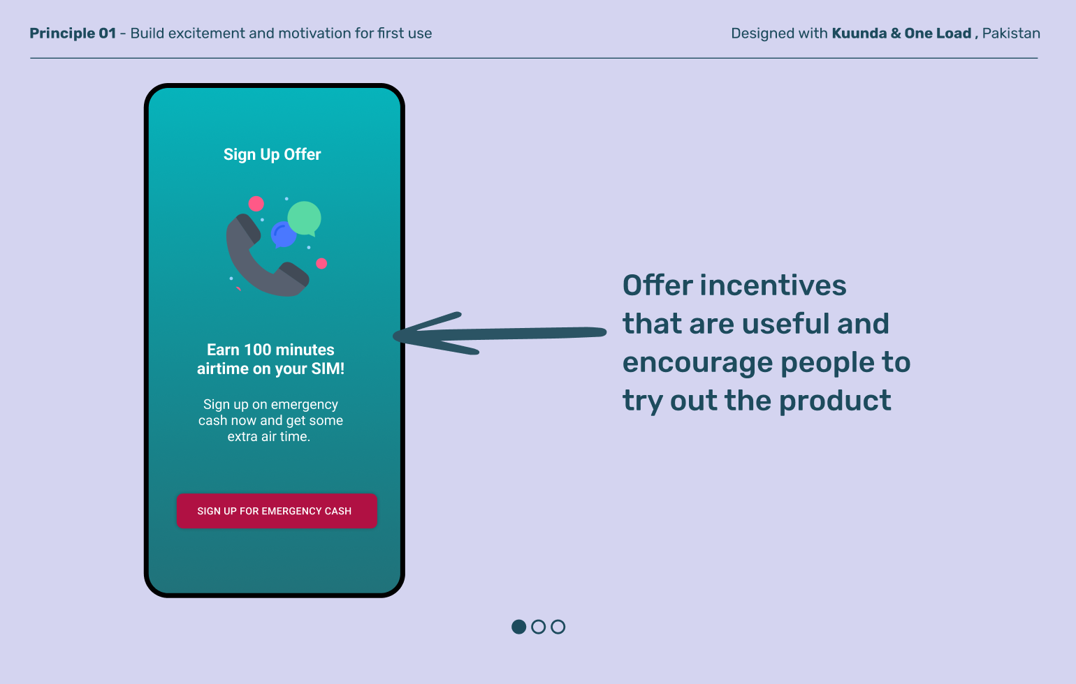
Build excitement and motivation for first use
↓
-
02
Create flexibility in how users interact
↓
-
03
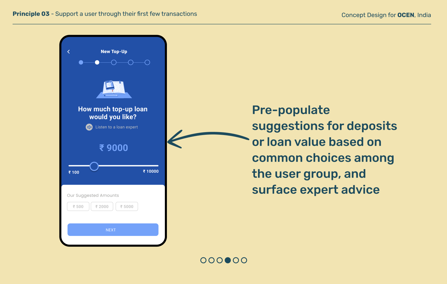
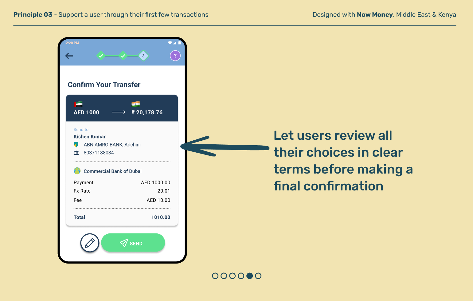
Support a user through their first few transactions
↓
-
04
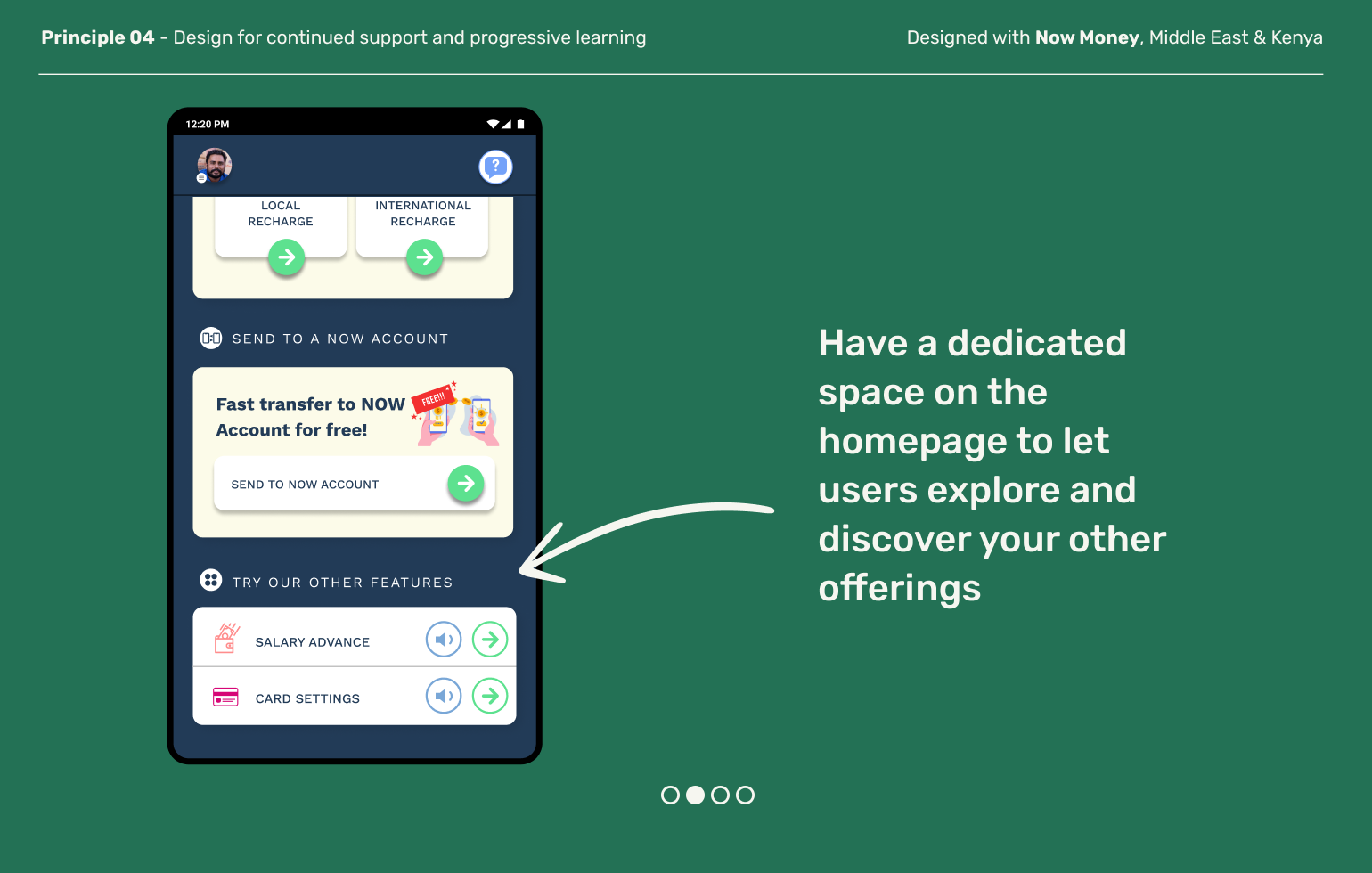
Design for continued support and progressive learning
↓
Principles in action
Build excitement and motivation for first use
Principle 01
The first transaction is usually the most overwhelming and often the scariest for users to complete. There’s a lot to fear and a lot unknown. After all, if they do it wrong, they worry they could lose money. Small incentives, including screen design, and bite sized nudges can encourage users to take that first step.
Principle 02
Create flexibility in how users interact with your products
Banks offer a variety of products, but not all low income users have the same needs. What users need can vary based on their profession, literacy, geography and more. Instead of overwhelming users with every product you have available, take the opportunity to learn about them up front and then surface relevant and contextual products to make them feel seen and supported.
Principle 03
Support a user through their first few transactions
The first few times a user transacts can be significant point of errors and drop-offs and can set the tone for the rest of their banking relationships. Active usage is not achieved in a single go, but built over time by providing users ongoing support and encouragement, and continually reinforcing your value proposition.
Design for continued support and progressive learning
Principle 04
As the user progresses, populate the home screen with relevant information to discover, creating shortcuts based on how they’re using the product and how they can move forward in their financial journey
Explore other moments in Digital Banking


