Financial Fluency
Build comfort with making financial interactions on a digital device
Principles at a glance
-
01
Use familiar mental models and clear language
↓
-
02
Surface suggestions at decision moments
↓
-
03
Be clear about consequences, good and bad
↓
-
04
Allow for consideration before commitment
↓
Principles in action
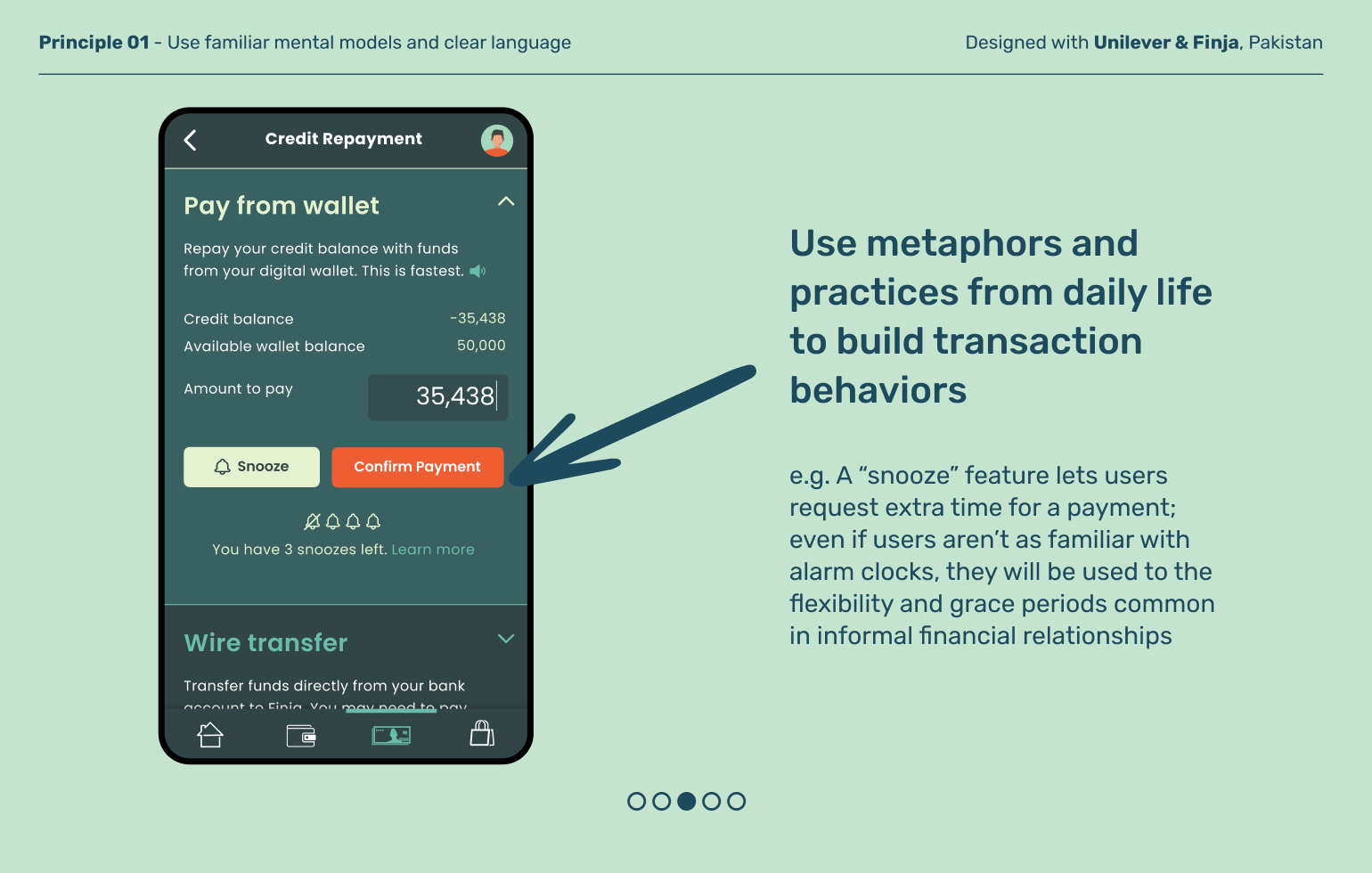
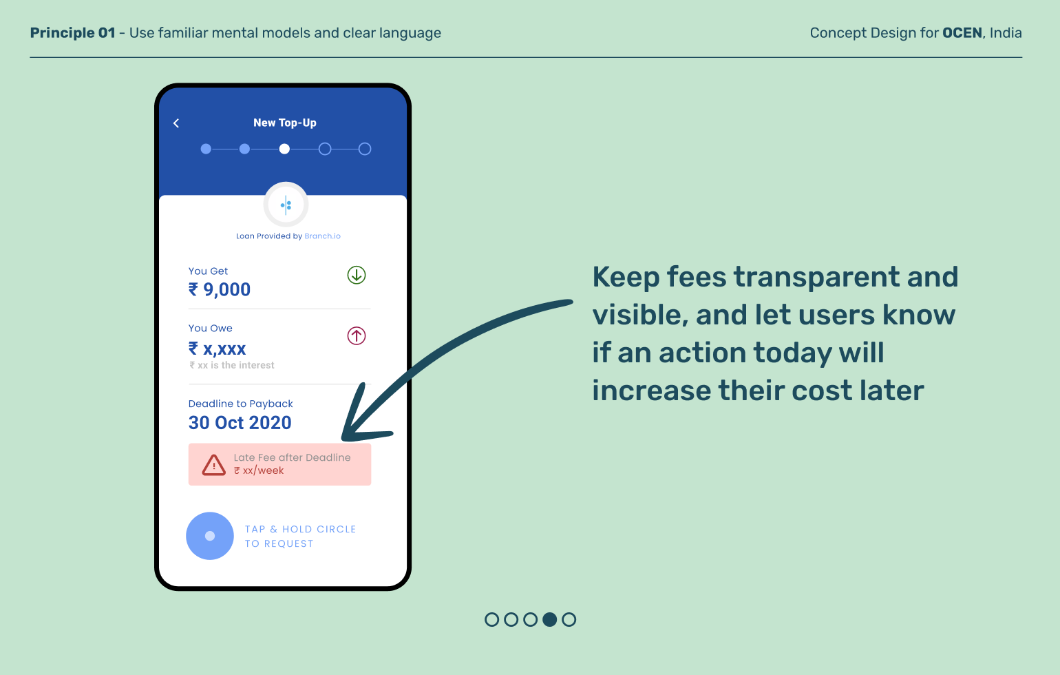
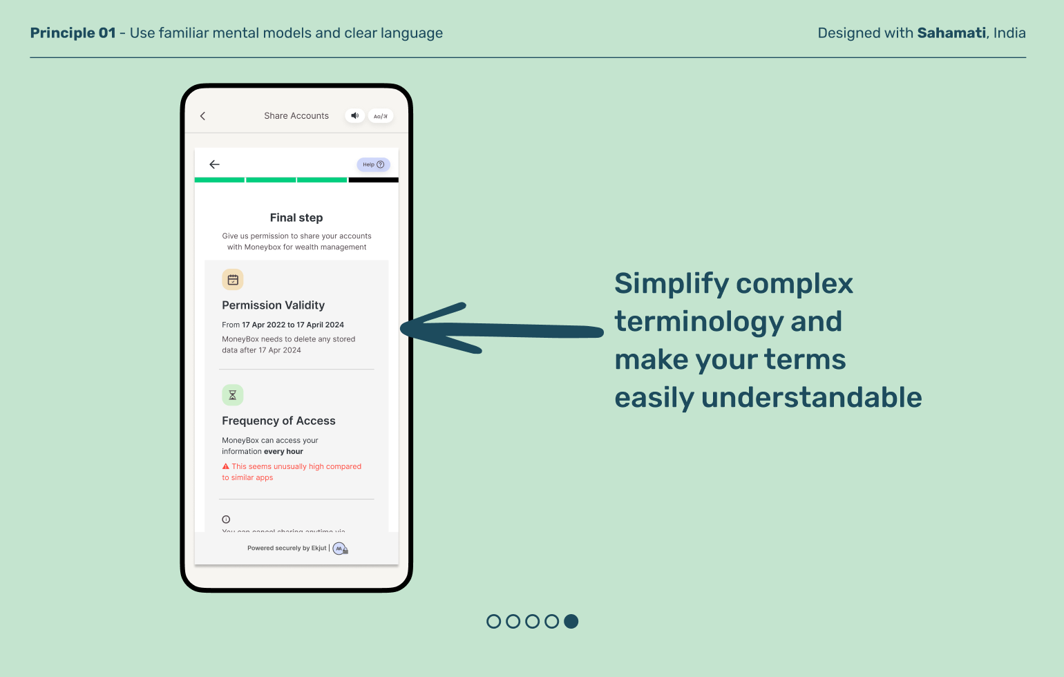
Use familiar mental models and clear language
Principle 01
Financial terms tend to make sense to bankers but not most other people. Design product language to mirror how your users actually communicate in order to be as accessible, clear, and transparent as possible. This not only increases understanding but can build relatability and trust.
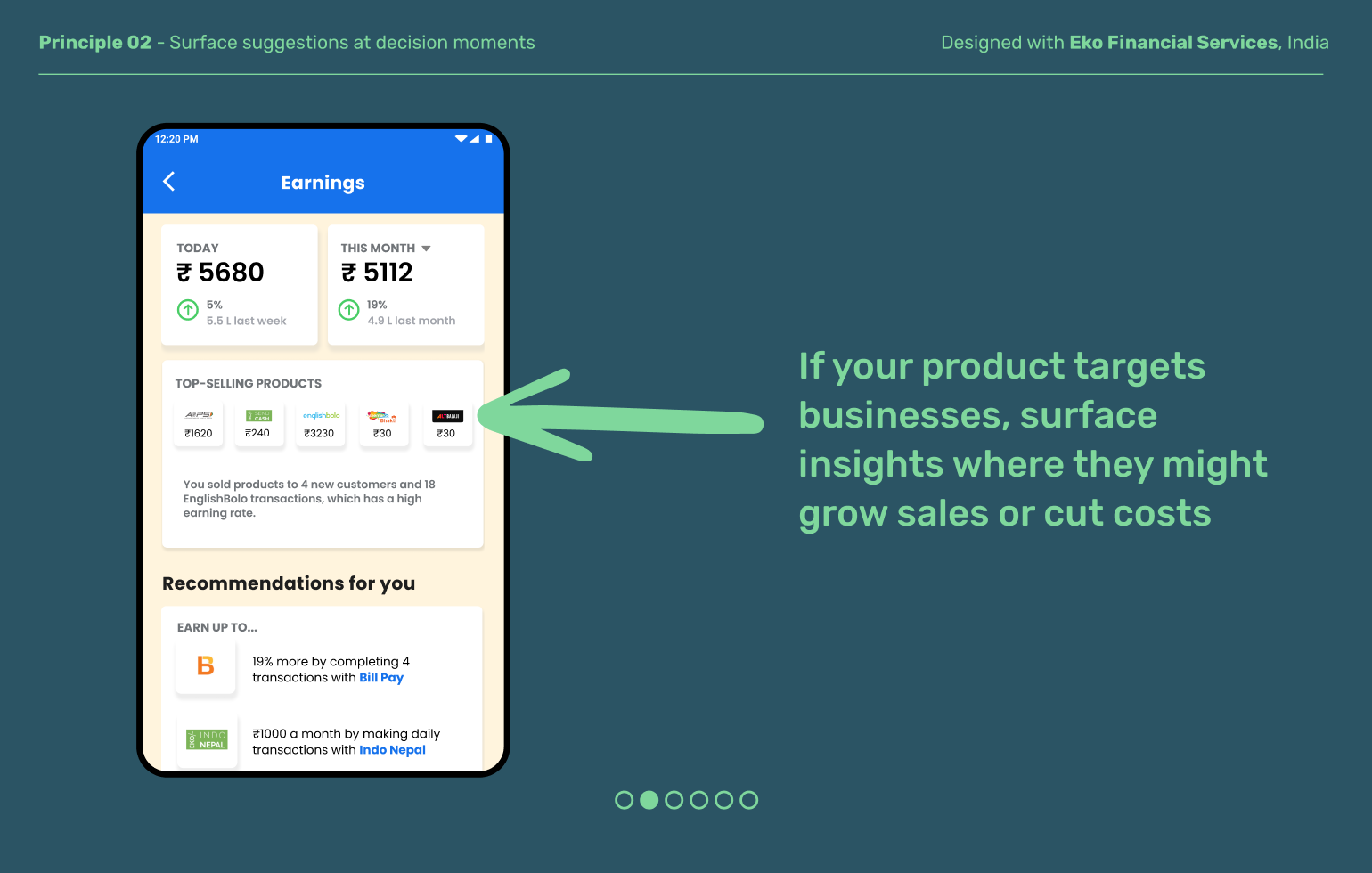
Principle 02
Surface suggestions at decision moments
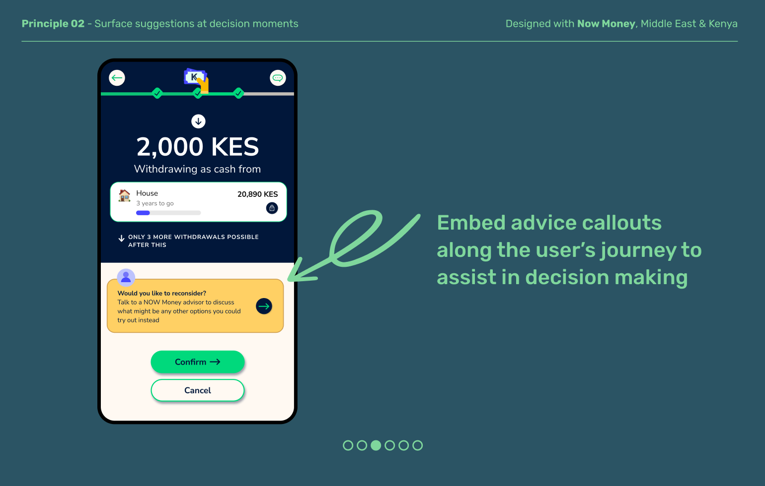
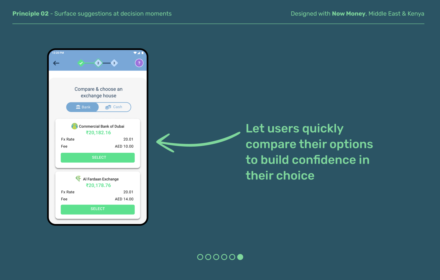
Users can struggle with digital financial decisions because the experience can feel abstract and there’s often no one to ask for advice like an agent. Good design offers both guidance and guardrails at key moments: education about the benefits and consequences, error-prevention features, and insights that help users make informed choices.
Be clear about consequences, good and bad
Principle 03
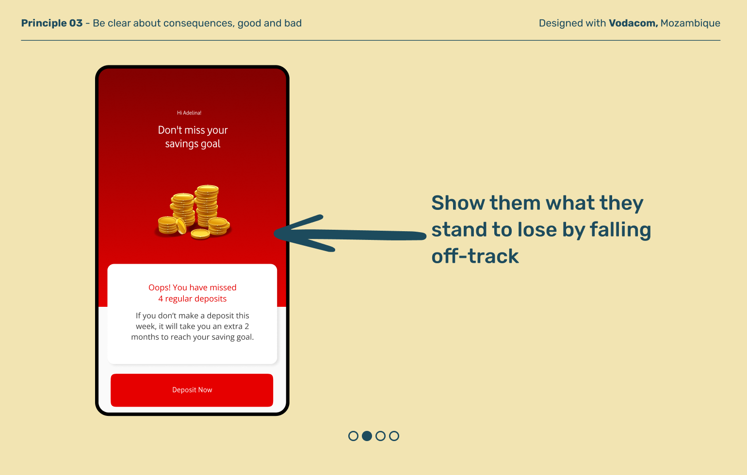
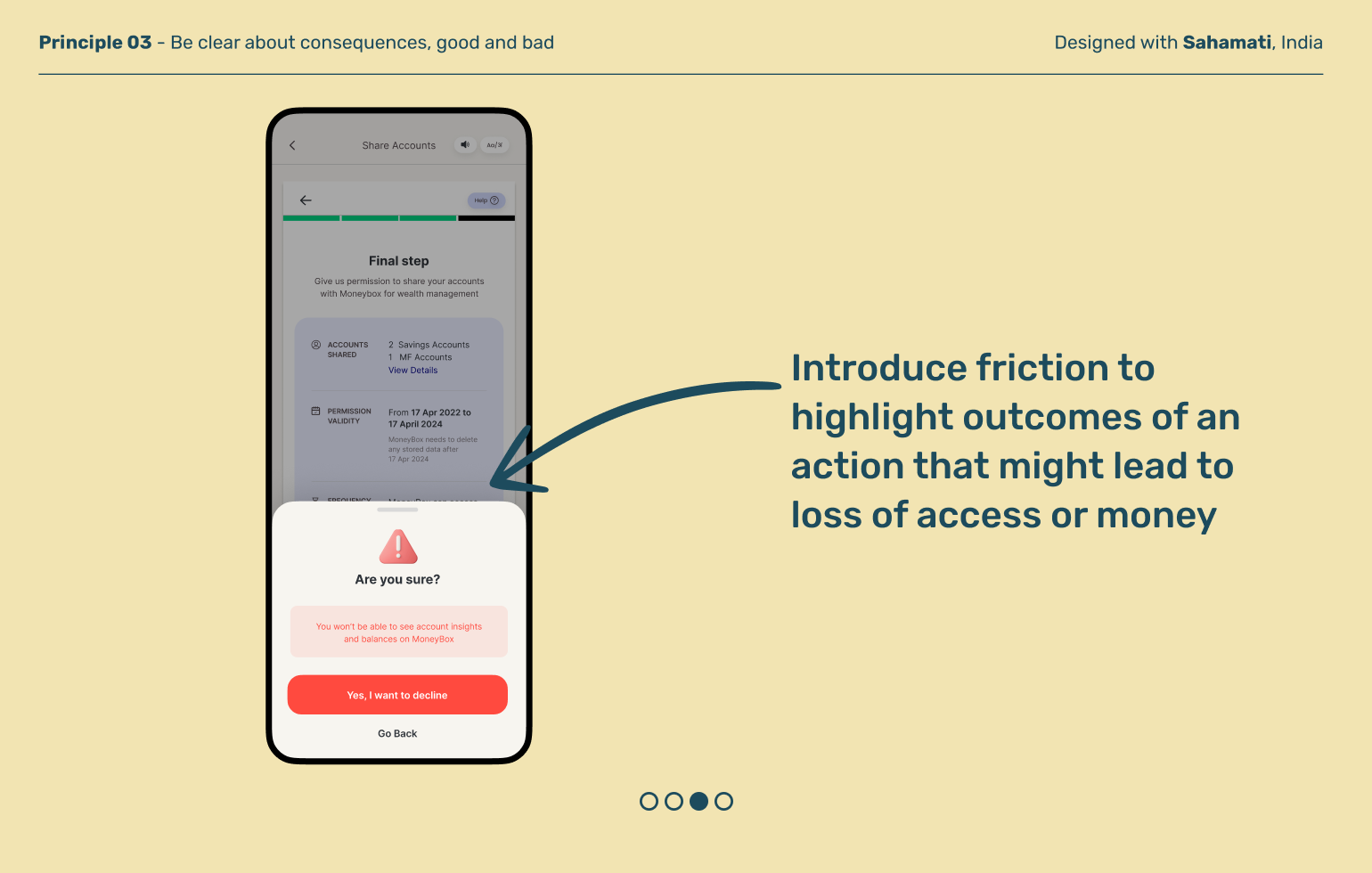
Help users understand the link between their actions and changes to their financial standing. Lift up positive behaviors in the near term, and point to financial health outcomes they can achieve with sustained behaviors over the long term. Leverage the digital benefit of frequent or real-time updates to be able to track their financial status.
Principle 04
Allow for consideration before commitment
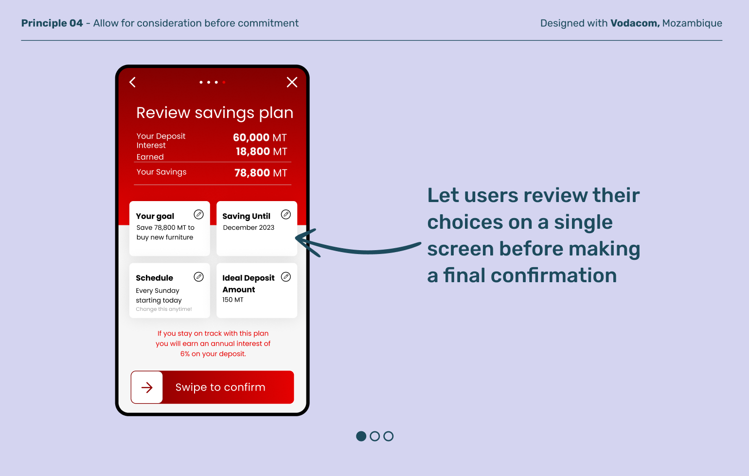
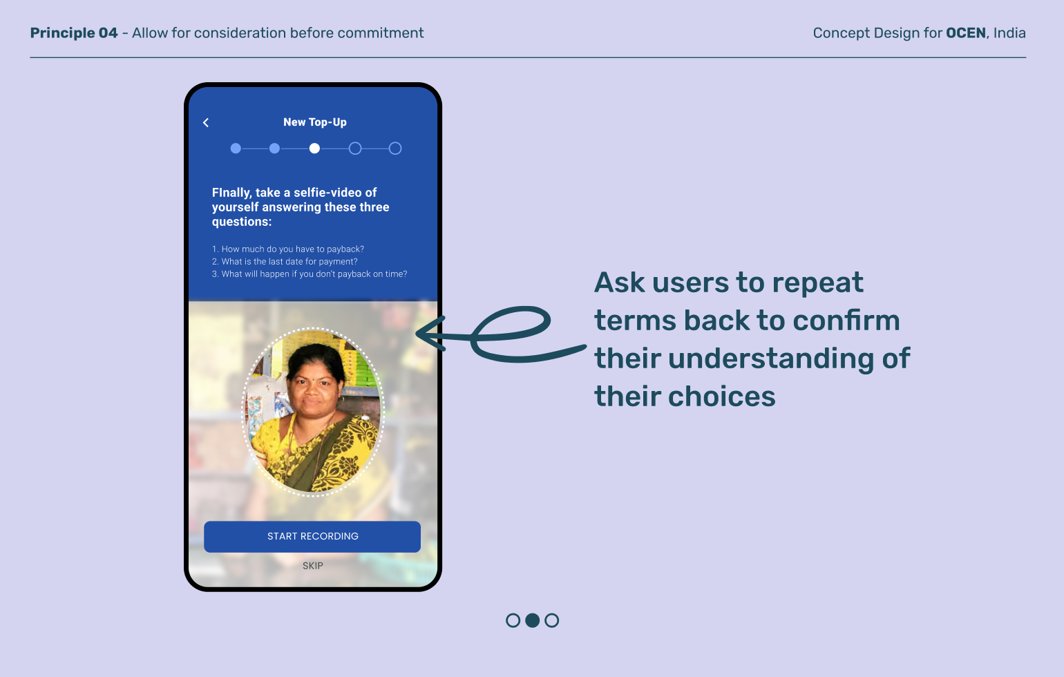
One tap can complete an action, but what if that tap happens by mistake? Especially on lower cost phones with smaller screen sizes, mistakes can be all too common. Designing for an intentional final confirmation moment gives users a helpful pause to evaluate their decision with confidence.
Explore other moments in Learning and Upskilling


