Chat Interfaces
Often, the first use case for a phone are messaging apps. Design with interaction paradigms your users are most familiar and comfortable with.
Principles at a glance
-
01
Jumpstart engagement through chat
↓
-
02
Break up text with engaging imagery
↓
-
03
Keep conversations feeling human
↓
Principles in action
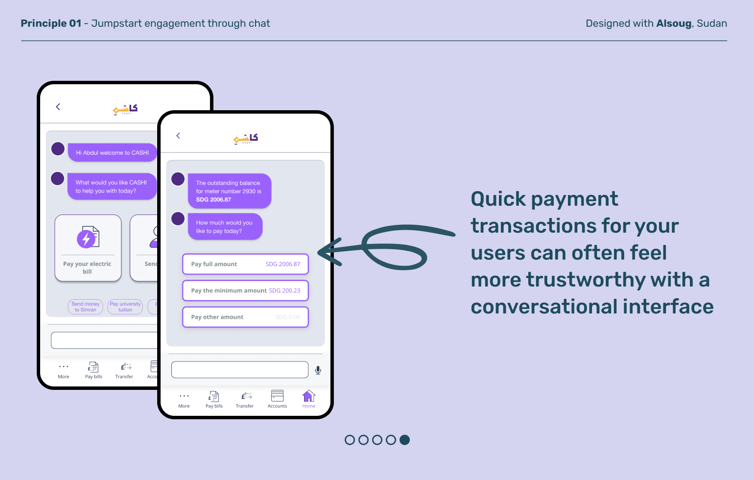
Jumpstart engagement through chat
Principle 01
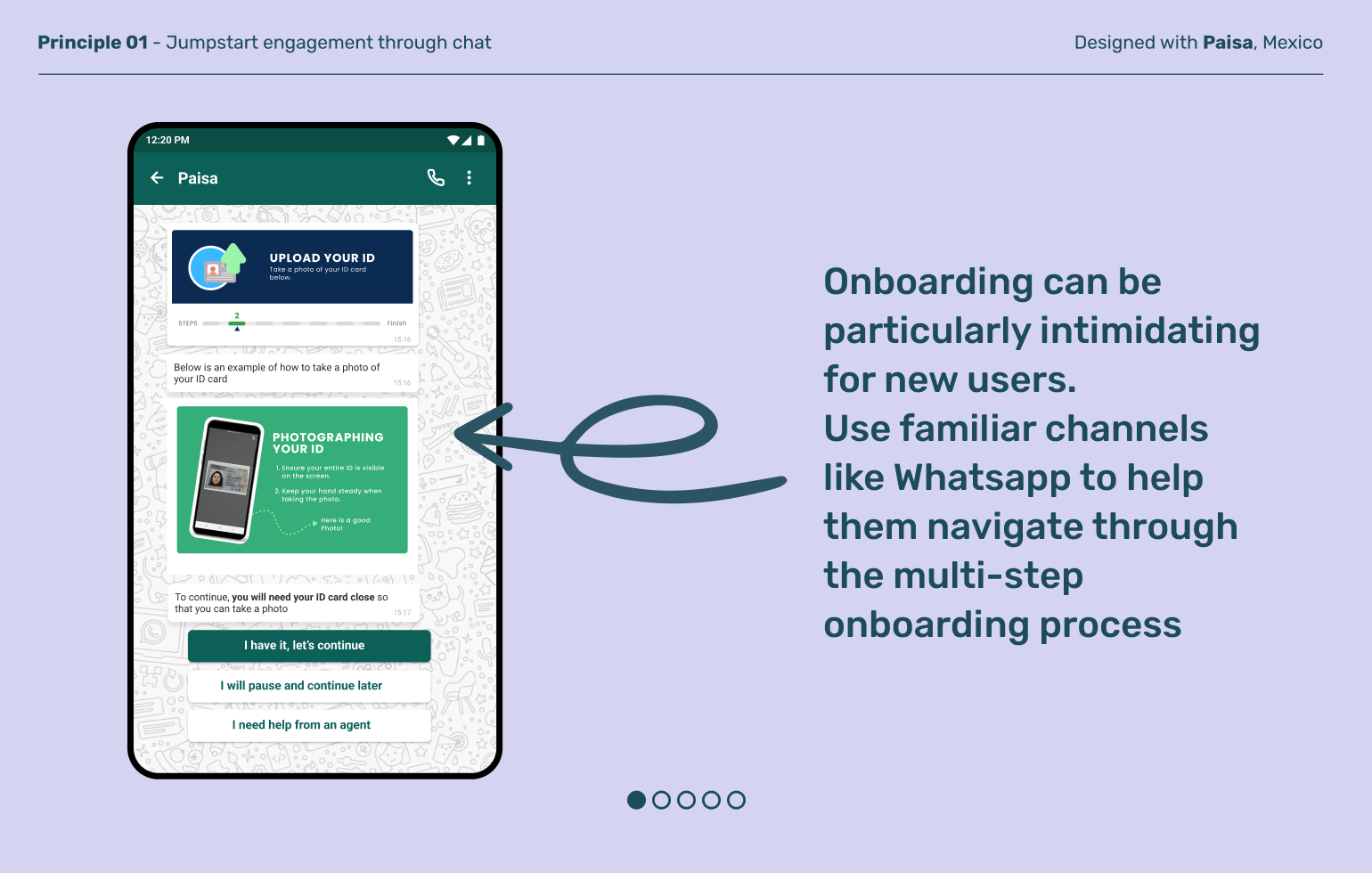
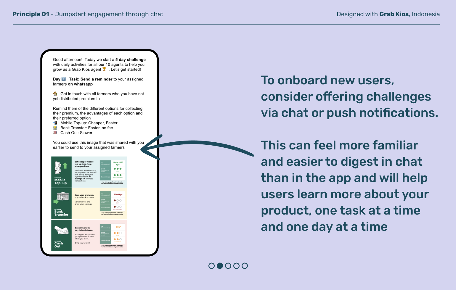
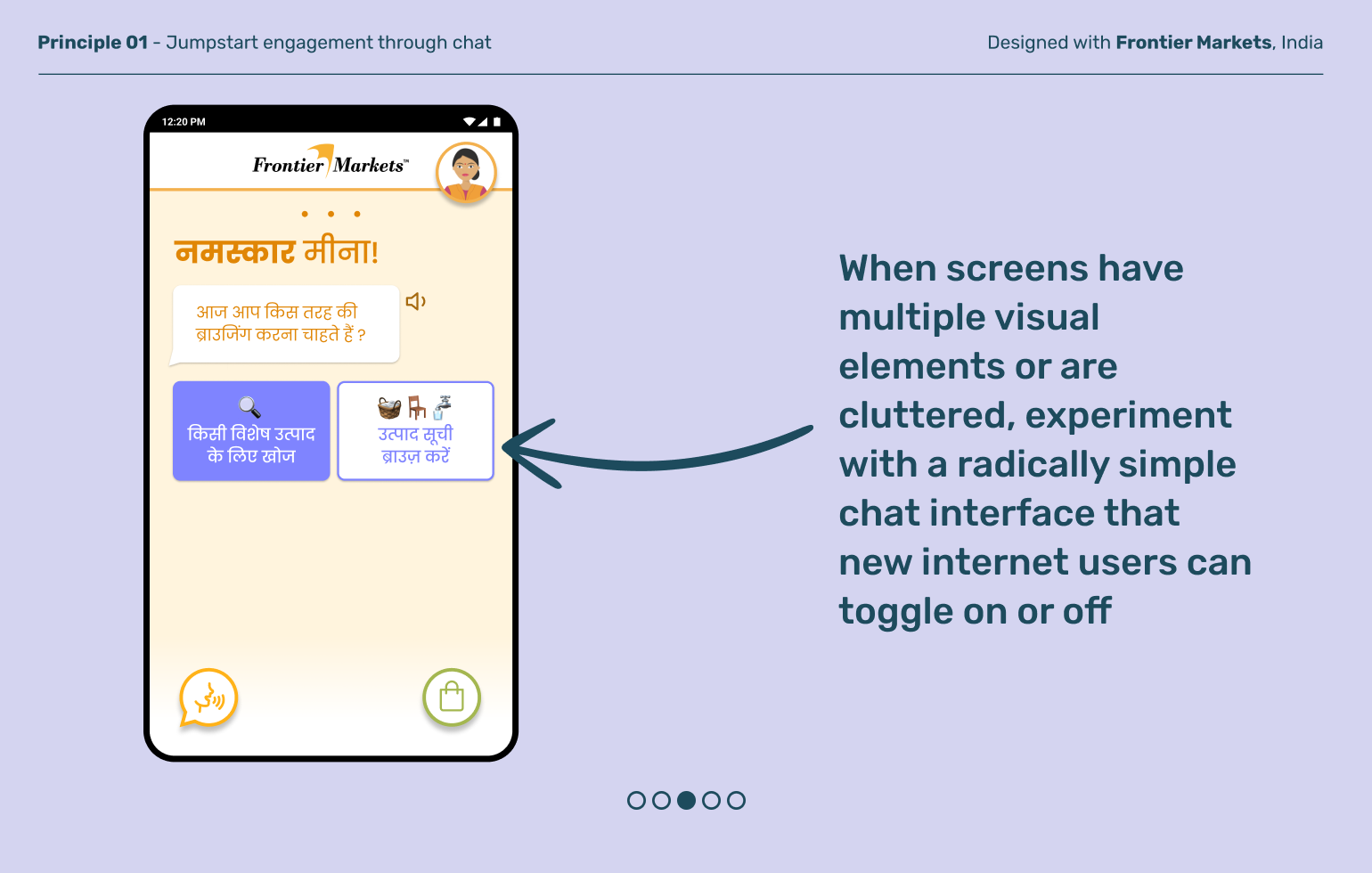
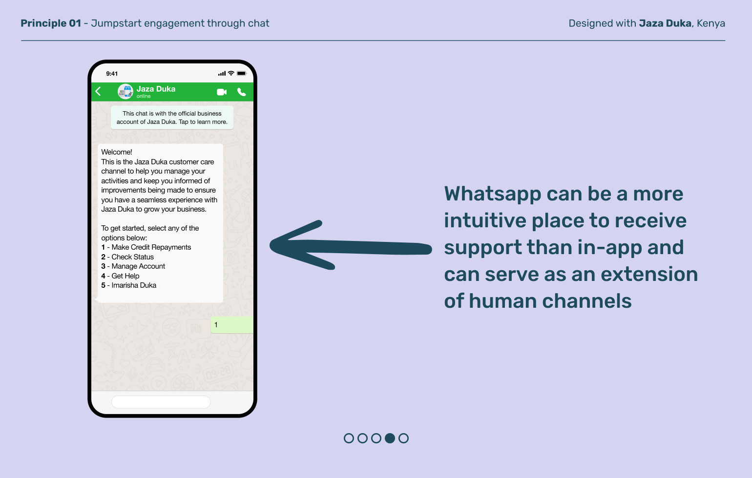
Nearly always, some of the first apps new internet users explore on smartphones are those that help them stay connected with friends and family, like Whatsapp. Support your product experience with interfaces like chat that build on familiar mental models and leverage behaviors built in the apps they’re confident using already.
Principle 02
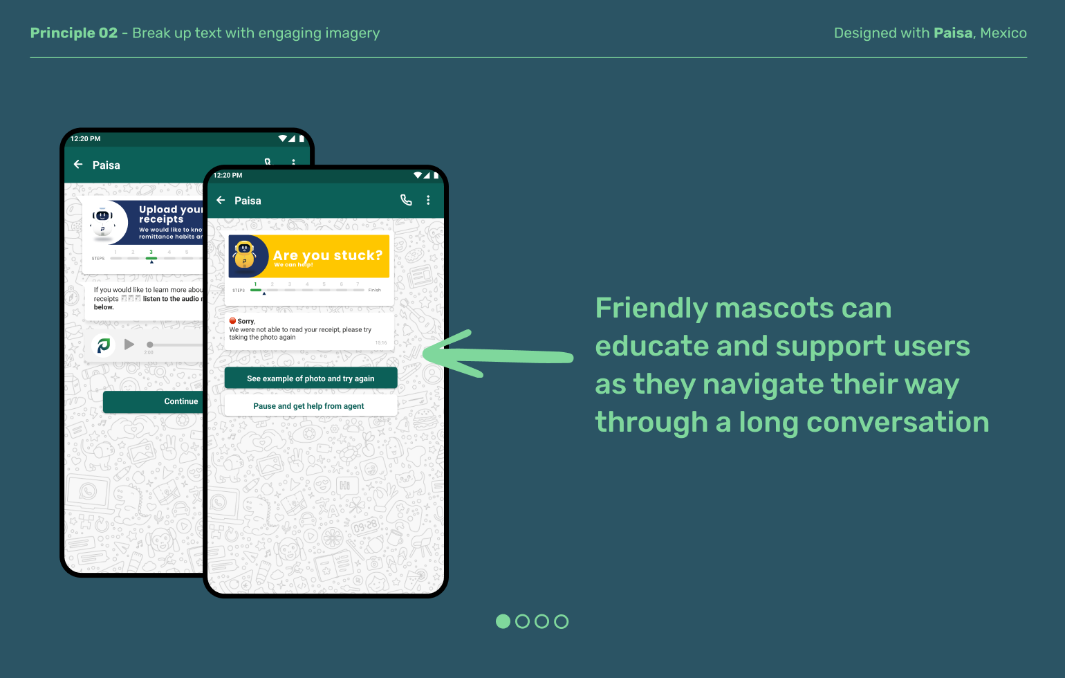
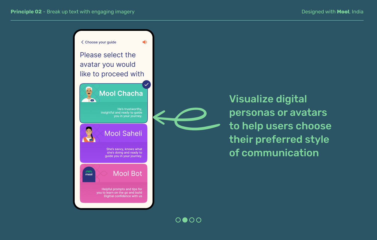
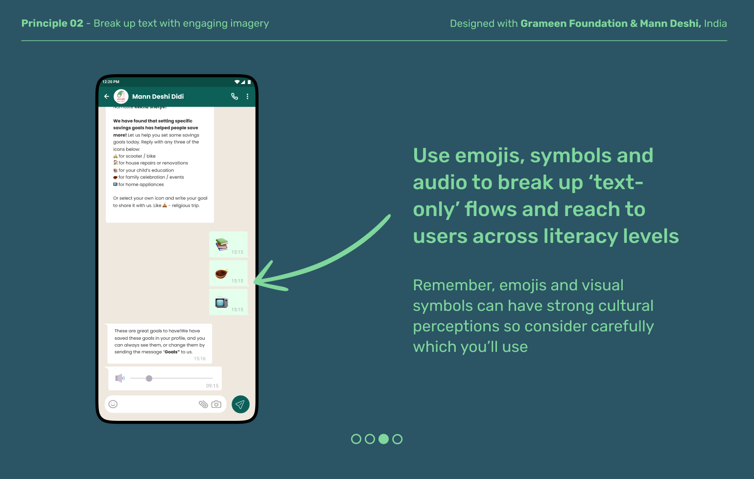
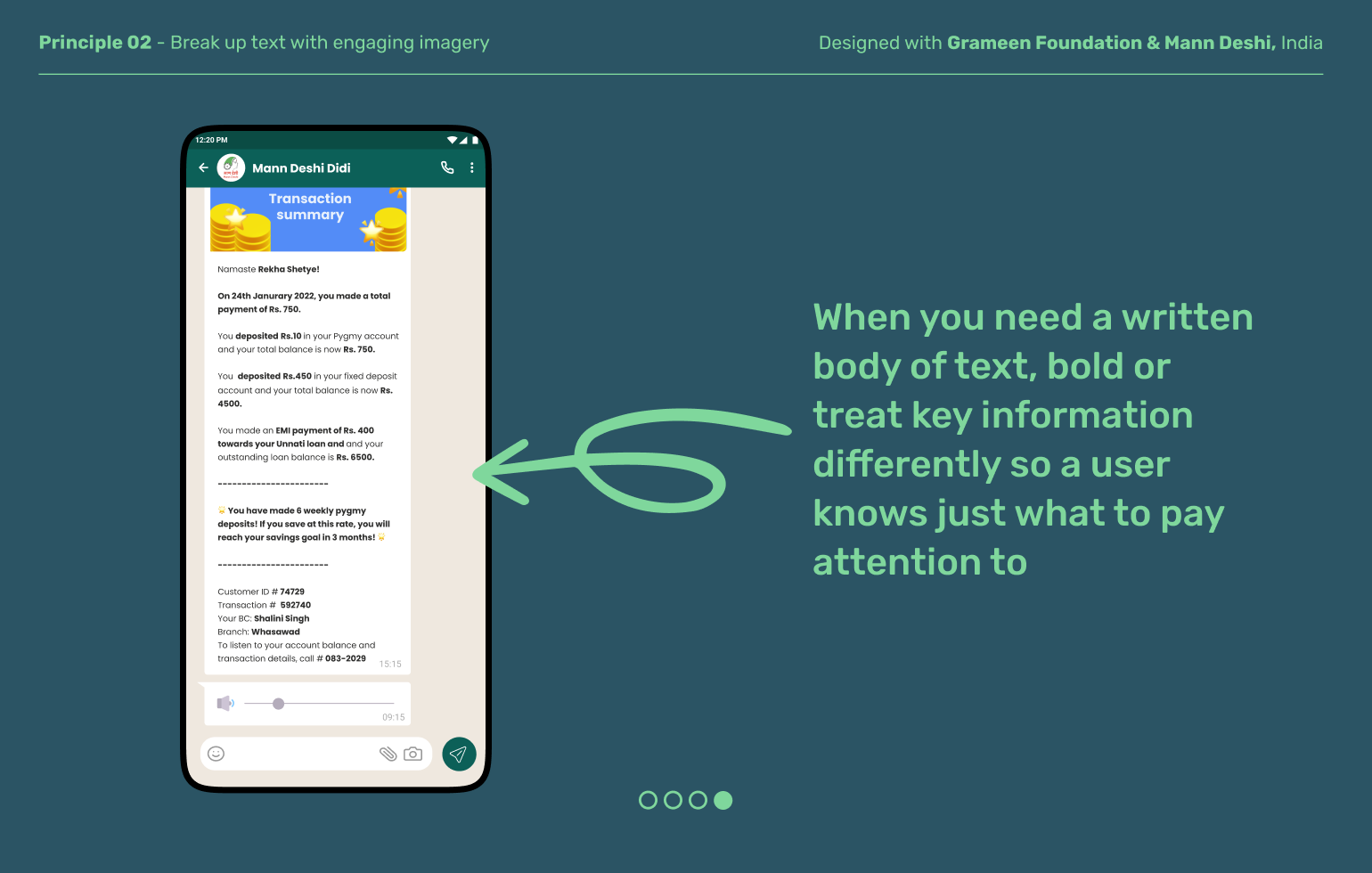
Break up text with engaging imagery
Chat interfaces are great starting points to help last mile users get comfortable with their device but they rely heavily typed input and textual output. That can feel especially long and frustrating in a non-social context. Intersperse your textual conversation with visuals, emojis and other media to help build engagement among your users.
Principle 03
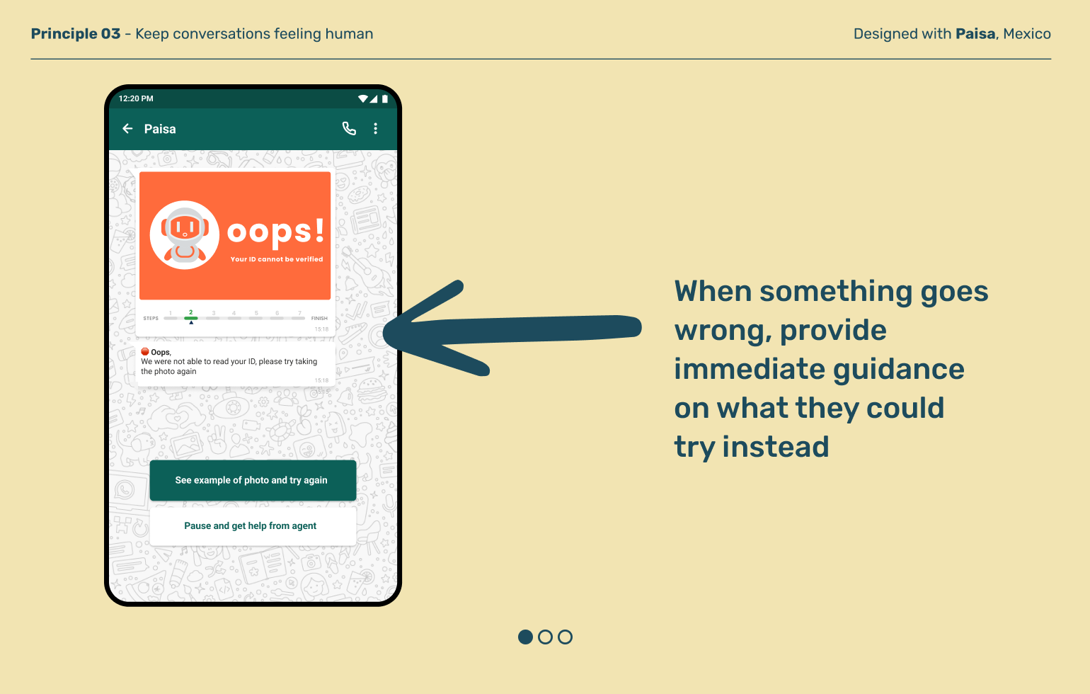
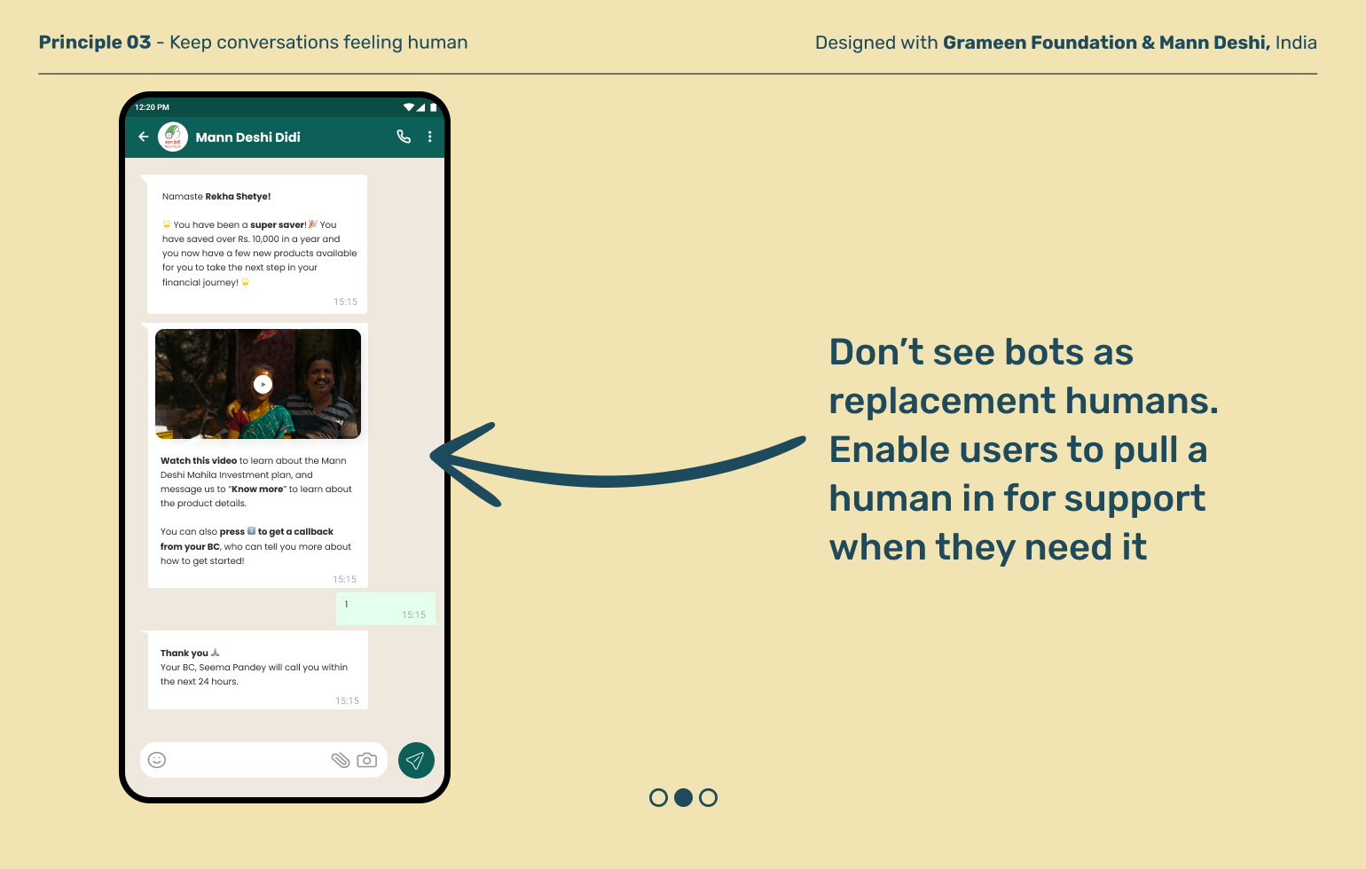
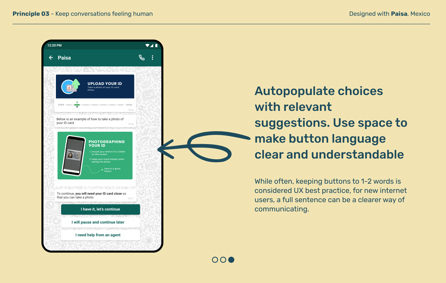
Keep conversations feeling human
Chat interfaces by nature lack the subtle nuances and non-verbal cues of face to face conversations. That’s especially true when the conversation is bot-led. Use language and guidance that helps your conversation feel natural and connect users to real people when needed.
Explore other moments in Conversational & Text Interfaces


